Minecraft PC IP: play.cubecraft.net

Should this map be added?


  • Total voters
    73
Status
Not open for further replies.

FireExcalibur10

Forum Expert
Jul 3, 2016
973
1,890
293
23
Andromeda
Hello! I have made some improvements on a previus version of that map so now looks cleaner and better :p Let me know what you guys think about it!
- Creator: FireExcalibur10
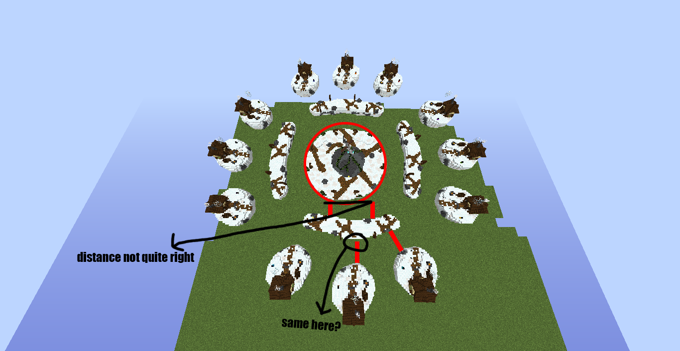
- Description: 12 islands, 3 chests per each. Sub-mid islands (3 -4 chests per each). Mid island (3 haunted houses with 3-4 chests per each , and some chests spread trough the mid too)
- Map name: Enchanted (name can be also changed to "Haunted").
Notes: I previously built a solo eggwars map about it with a sword but after some feedback from the community and some advices from Efcluke94 from a previous post, I have decided to turn the map into a solo skywars map with no sword or big rock, just a little and enchanted village!
 

Attachments

  • 2020-06-13_14.16.15.png
    2020-06-13_14.16.15.png
    327 KB · Views: 210
  • 2020-06-13_14.16.07.png
    2020-06-13_14.16.07.png
    321.2 KB · Views: 188
  • 2020-06-13_14.16.31.png
    2020-06-13_14.16.31.png
    111.2 KB · Views: 175
  • 2020-06-13_14.16.36.png
    2020-06-13_14.16.36.png
    163.2 KB · Views: 173
  • 2020-06-13_14.16.21.png
    2020-06-13_14.16.21.png
    107.1 KB · Views: 165
  • 2020-06-13_14.16.44.png
    2020-06-13_14.16.44.png
    132.5 KB · Views: 180
  • 2020-06-13_14.17.03.png
    2020-06-13_14.17.03.png
    445.6 KB · Views: 174
  • 2020-06-13_14.16.55.png
    2020-06-13_14.16.55.png
    251.5 KB · Views: 154
  • 2020-06-13_14.17.07.png
    2020-06-13_14.17.07.png
    286.7 KB · Views: 154
  • 2020-06-13_14.17.28.png
    2020-06-13_14.17.28.png
    275.3 KB · Views: 163
  • 2020-06-13_14.17.23.png
    2020-06-13_14.17.23.png
    447.8 KB · Views: 162
  • 2020-06-13_14.17.34.png
    2020-06-13_14.17.34.png
    413.8 KB · Views: 144
  • 2020-06-13_14.17.42.png
    2020-06-13_14.17.42.png
    430.8 KB · Views: 139
  • 2020-06-13_14.17.51.png
    2020-06-13_14.17.51.png
    437.6 KB · Views: 139
  • 2020-06-13_14.17.58.png
    2020-06-13_14.17.58.png
    319.2 KB · Views: 144
  • 2020-06-13_14.18.05.png
    2020-06-13_14.18.05.png
    280.3 KB · Views: 129
  • 2020-06-13_14.18.27.png
    2020-06-13_14.18.27.png
    201.8 KB · Views: 124
  • 2020-06-13_14.18.38.png
    2020-06-13_14.18.38.png
    236.5 KB · Views: 112
  • 2020-06-13_14.18.43.png
    2020-06-13_14.18.43.png
    227.9 KB · Views: 125
  • 2020-06-13_14.18.50.png
    2020-06-13_14.18.50.png
    155.6 KB · Views: 123
  • 2020-06-13_14.18.54.png
    2020-06-13_14.18.54.png
    137.8 KB · Views: 122
  • 2020-06-13_14.19.02.png
    2020-06-13_14.19.02.png
    612.2 KB · Views: 118
  • 2020-06-13_14.19.09.png
    2020-06-13_14.19.09.png
    534.7 KB · Views: 125
  • 2020-06-13_14.19.23.png
    2020-06-13_14.19.23.png
    349.6 KB · Views: 121
  • 2020-06-13_14.19.42.png
    2020-06-13_14.19.42.png
    454.7 KB · Views: 126
  • 2020-06-13_14.19.53.png
    2020-06-13_14.19.53.png
    405.6 KB · Views: 156
Last edited:

ItzEnd3r

Forum Expert
Aug 18, 2019
1,352
3,922
384
19
Boulder
www.cubecraft.net
I like it, but I was wondering what blocks you used, it looks like either you used a pvp texture pack for the pictures or you used concrete / concrete powder. I voted no because if that is concrete it cant be used, if it isnt then i can change me vote :P
2020-06-10_17.21.47.png
 

FireExcalibur10

Forum Expert
Jul 3, 2016
973
1,890
293
23
Andromeda
I like it, but I was wondering what blocks you used, it looks like either you used a pvp texture pack for the pictures or you used concrete / concrete powder. I voted no because if that is concrete it cant be used, if it isnt then i can change me vote :pView attachment 167223
YesI used a texture pack. It only changes the stone tone which is a bit darker but nonetheless looks the same with the default one
 

Zathelas

Forum Veteran
Jul 14, 2018
1,123
4,528
404
18
A Skywars Island
I think this is a yes for me!

I really can't see how big the houses are and how big the islands are. Like everything, I think there is enough pvp space so that's awesome! Maybe the mid island can be bigger but I don't know that's needed. Short summary but I don't have anything to say anymore.

Great map! :)
 

FireExcalibur10

Forum Expert
Jul 3, 2016
973
1,890
293
23
Andromeda
@Riley @Eli Looking through all my map submissions I just noticed you both vote no all the time and sometimes do not explain why the decision of the vote and not giving feedback. I would really appreciate the opinion of you to improve the map, thanks.
 

Eli

Forum Veteran
Dec 25, 2017
1,305
6,687
408
18
Bogota, Colombia
Alright so, I voted no for the map for two main reasons:
- The Colours
- The Theme

Excalibur is really not a great theme to build a map I'd think, or at least the way you evidence it in the map doesn't really show anything very interesting. It's just a few houses around a sword on a rock, I know that's the theme you chose but it's really nothing that attention grabbing or visually appealing.
I also find the map really dull and the colours don't convince me, it's all rather dark, it feels plain and somewhat boring. Hope my feedback helps
 

LordSidi0us

Forum Expert
Mar 1, 2019
2,447
2,096
254
Coruscant
I'm usually not a big fan of the snow-themed maps, but this one looks very nice, plus it is well decorated in my opinion.
I don't see anything wrong here and I like it, so that's one yes from me:).
 
  • Like
Reactions: FireExcalibur10

FireExcalibur10

Forum Expert
Jul 3, 2016
973
1,890
293
23
Andromeda
Alright so, I voted no for the map for two main reasons:
- The Colours
- The Theme

Excalibur is really not a great theme to build a map I'd think, or at least the way you evidence it in the map doesn't really show anything very interesting. It's just a few houses around a sword on a rock, I know that's the theme you chose but it's really nothing that attention grabbing or visually appealing.
I also find the map really dull and the colours don't convince me, it's all rather dark, it feels plain and somewhatboring. Hope my feedback helps
Well that really depends on looking from a point of view instead of a picture. The thematic is well represented in my opinion (what to expect more of the sword itself if that is the point of the map). Maybe palette could be replaced but overall is just OK. Hope that helps.
 

Story

Forum Professional
Jan 30, 2014
4,575
18,917
679
23
Glasgow
letterboxd.com
I think the map as a whole is quite generic as a concept, it has a cool name but is not well represented through the visuals. This might be because of the idea in general, when you have a vague concept like "halloween", "desert" or "bamboo" there are many many different builds you can mix into the map to represent the concept, but for "Excalibur"? Not really any other than the sword.

I'm not really sure what kind of 'world' design you are going for here, because there are leaves at mid, the side of the house has grass with flowers, yet the rest of the map is full of stones in a snow wasteland, it doesnt really work well together.

I cant really comment too much on gameplay for EggWars maps but it is quite flat which is nice however I must say, the house are far too easy to camp in, I've never found small indoors to be a great gameplay choice in any pvp gamemodes, any closed spaces should be player created and not supplied by the map, especially in EW since the maps are not destructable.

Some quick pointers:
  • Sword needs to look more like a sword
  • The podzol clashes very hard with the snow and sticks out, and because its random on the mid & inner ring it makes it look really bad.
  • The gameplay layout looks pretty good to me.
  • The middle island posts have glowstone blocks but the inner island posts do not.
  • You didnt really show the interiors.
  • The top-down view shows that the stone at mid is off-centre, the mid itself is off centre and the inner islands are also slightly off.

I really don't want this to come across as very negative, these are just some things I noticed that I think you could have a quick brainstorm about. 😄
 

Priley

Forum Professional
Jul 6, 2015
4,118
16,202
679
21
reprotland
I think the overall layout is very boring -- nothing special, feels like a SkyWars map, rush-based.
The only thing that makes this map feel like "Excalibur" is the sword in the middle. You've mixed podzol, a very dark brown coloured block, combined with snow, a very white block.

The distance from certain spawn islands to sub-mid is longer than for other islands (as can be seen on the image). The middle island isn't a perfect circle which (see image), too, gives certain sub-mids have a longer distance to the middle than others. It doesn't necessarily have to be a perfect circle, but the distance from all sub-mids to the middle should be equal

9okMBSX.png


Aside from all of this, apart from the middle island, I can't see any other improvements after looking at your previous map submission? https://www.cubecraft.net/threads/solo-eggwars-excalibur.220243/
And again, you used a custom texture pack that makes stone darker. I personally think this makes your map look less visually pleasing, so please do change the screenshots without using a texture pack! 🥳
 

Priley

Forum Professional
Jul 6, 2015
4,118
16,202
679
21
reprotland
@Riley @Eli Looking through all my map submissions I just noticed you both vote no all the time and sometimes do not explain why the decision of the vote and not giving feedback.
I would like to reply to this: this is completely false. I have always given feedback to your maps, either by liking other people's feedback, so basically agreeing with him, or by actually replying.
 
  • Like
Reactions: _The13thDoctor_

FireExcalibur10

Forum Expert
Jul 3, 2016
973
1,890
293
23
Andromeda
I think the overall layout is very boring -- nothing special, feels like a SkyWars map, rush-based.
The only thing that makes this map feel like "Excalibur" is the sword in the middle. You've mixed podzol, a very dark brown coloured block, combined with snow, a very white block.

The distance from certain spawn islands to sub-mid is longer than for other islands (as can be seen on the image). The middle island isn't a perfect circle which (see image), too, gives certain sub-mids have a longer distance to the middle than others. It doesn't necessarily have to be a perfect circle, but the distance from all sub-mids to the middle should be equal

9okMBSX.png


Aside from all of this, apart from the middle island, I can't see any other improvements after looking at your previous map submission? https://www.cubecraft.net/threads/solo-eggwars-excalibur.220243/
And again, you used a custom texture pack that makes stone darker. I personally think this makes your map look less visually pleasing, so please do change the screenshots without using a texture pack! 🥳
Thank you! I am going to upload new pictures with the default one. I have changed the whole palette of the map and improved the distance on the islands. Islands do not have to be a perfect circle tho because of its aesthetics. Thanks for taking the time on reply :P
I think the map as a whole is quite generic as a concept, it has a cool name but is not well represented through the visuals. This might be because of the idea in general, when you have a vague concept like "halloween", "desert" or "bamboo" there are many many different builds you can mix into the map to represent the concept, but for "Excalibur"? Not really any other than the sword.

I'm not really sure what kind of 'world' design you are going for here, because there are leaves at mid, the side of the house has grass with flowers, yet the rest of the map is full of stones in a snow wasteland, it doesnt really work well together.

I cant really comment too much on gameplay for EggWars maps but it is quite flat which is nice however I must say, the house are far too easy to camp in, I've never found small indoors to be a great gameplay choice in any pvp gamemodes, any closed spaces should be player created and not supplied by the map, especially in EW since the maps are not destructable.

Some quick pointers:
  • Sword needs to look more like a sword
  • The podzol clashes very hard with the snow and sticks out, and because its random on the mid & inner ring it makes it look really bad.
  • The gameplay layout looks pretty good to me.
  • The middle island posts have glowstone blocks but the inner island posts do not.
  • You didnt really show the interiors.
  • The top-down view shows that the stone at mid is off-centre, the mid itself is off centre and the inner islands are also slightly off.

I really don't want this to come across as very negative, these are just some things I noticed that I think you could have a quick brainstorm about. 😄
Thankyou so much story, will take that into account and think about another name and make a cool palette for the map. :P
 

FireExcalibur10

Forum Expert
Jul 3, 2016
973
1,890
293
23
Andromeda
Hello! I have made some improvements on a previus version of that map so now looks cleaner and better :p Let me know what you guys think about it!
- Creator: FireExcalibur10
- Description: 12 islands, 3 generators per each (1 diamond, 1 gold and 1 iron). Sub-mid islands (2 generators: 1 gold and 1 iron). Mid island (6 generators: 2 level 3 diamond gens, 2 gold gens and 2 iron gens).
- Map name: Excalibur or Mystery or Enchanted
Notes: I have reduced the size of the stone at mid, changed the palette of the whole map adding more stone tones and other white blocks and revamped lantern designs.
Improved :P
 
Status
Not open for further replies.
Members Online

Team online

Latest profile posts

we want cubecraft 2023 :(
This is YOUR daily dose of facts #40-
Walt Disney currently holds the most Academy Awards. Till now, Disney won 26 Oscars. Disney is nominated a grand total of 59 times!
Eli wrote on Xi1m's profile.
Thanks for the follow!!!
Eli
"What say you?" said he, the abyss did not respond back.
Top Bottom