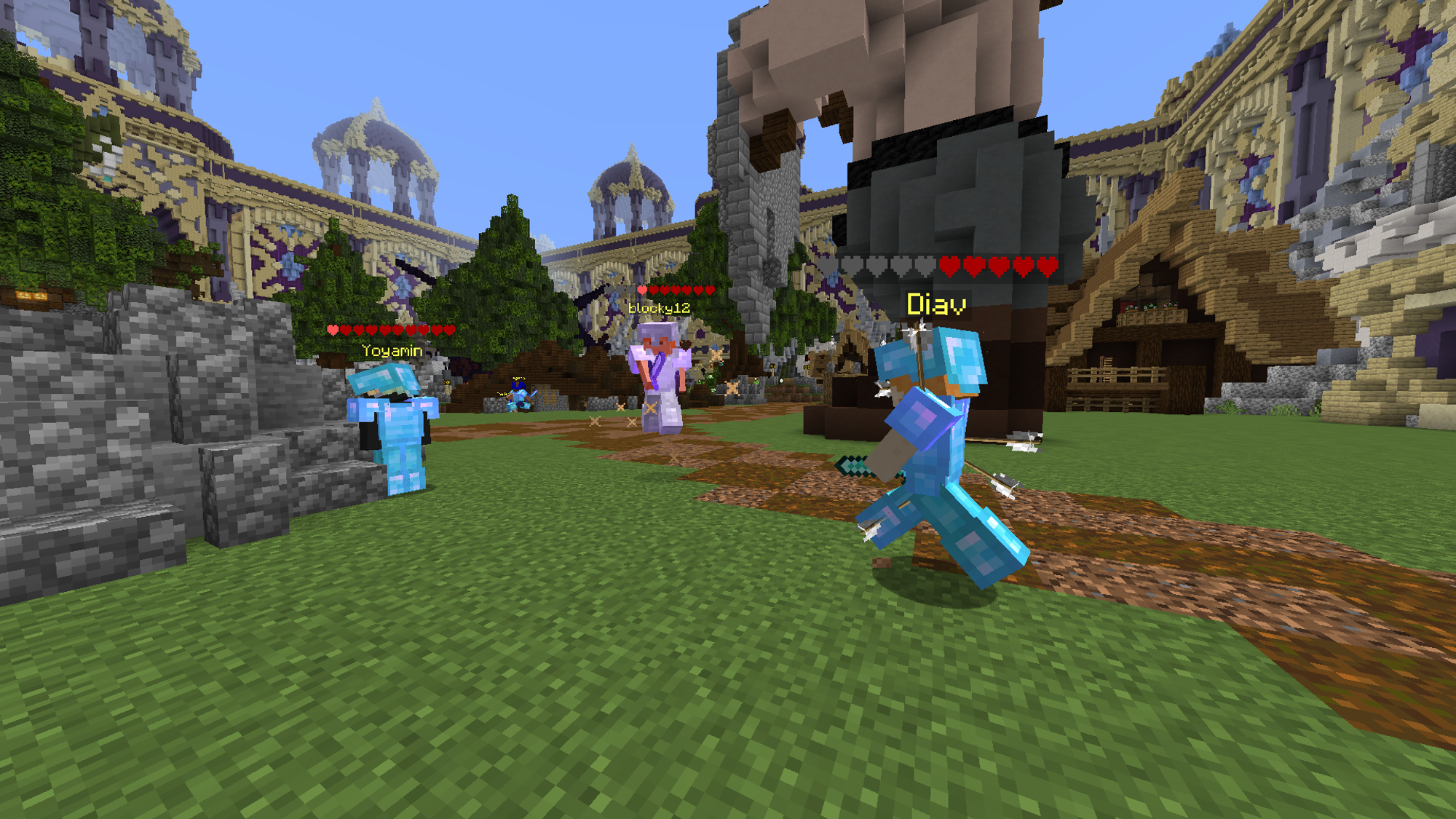
Okay, so I'm sure a lot of you have seen this video on the damage indicator progress right here:
 www.notion.so
So far, in my opinion, it's looking really good, however, I have a few nit-picky suggestions I'd like to rattle off here.
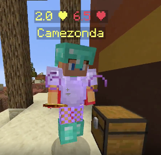
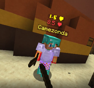
• Instead of having both the absorption health and normal health side by side, make them stack on top of each other to create a simpler, more elegant look. With the current design, players would have to focus a bit more to adjust to the change from having the normal health centred to a bit to the right when the opponent eats a golden apple.
Current Design:
New Design:
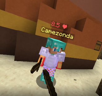
• Make the text displaying the amount of health a player has white instead of the same colour as the heart. This would provide better contrast and a nicer look.
Current look:
Improvised Look (I made it under a minute xD):

If the developers can take this idea into consideration, I'd really appreciate it!
Great work so far!

Progress | Notion
If you have not already read the previous boards it's recommended you do so. In this board we will be discussing the implementation of Option 2.
So far, in my opinion, it's looking really good, however, I have a few nit-picky suggestions I'd like to rattle off here.
• Instead of having both the absorption health and normal health side by side, make them stack on top of each other to create a simpler, more elegant look. With the current design, players would have to focus a bit more to adjust to the change from having the normal health centred to a bit to the right when the opponent eats a golden apple.
Current Design:
New Design:
• Make the text displaying the amount of health a player has white instead of the same colour as the heart. This would provide better contrast and a nicer look.
Current look:
Improvised Look (I made it under a minute xD):
If the developers can take this idea into consideration, I'd really appreciate it!
Great work so far!


