Minecraft PC IP: play.cubecraft.net

Do you want this map to be added to Solo Skywars?

  • Yes

    Votes: 6 35.3%
  • No

    Votes: 11 64.7%

  • Total voters
    17
Status
Not open for further replies.

Axyy

Forum Expert
Oct 18, 2016
767
3,739
384
Gone
www.cubecraft.net
(Note: I really like the current "Field" map and I think it's amazing to play on it! The reason I made a 2.0 version is because I really like football and wanted to give it a go!)

MAP NAME
Field 2.0

MAP CREATOR
Axyy

MAP DESCRIPTION
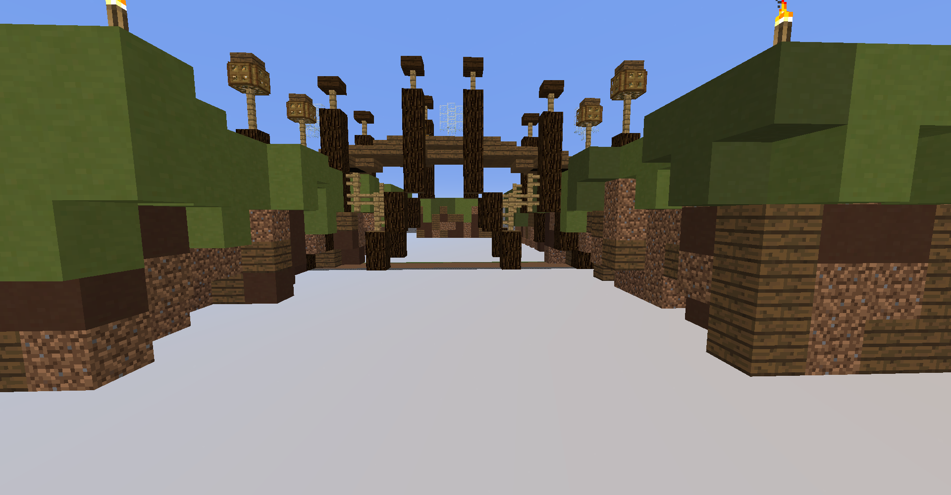
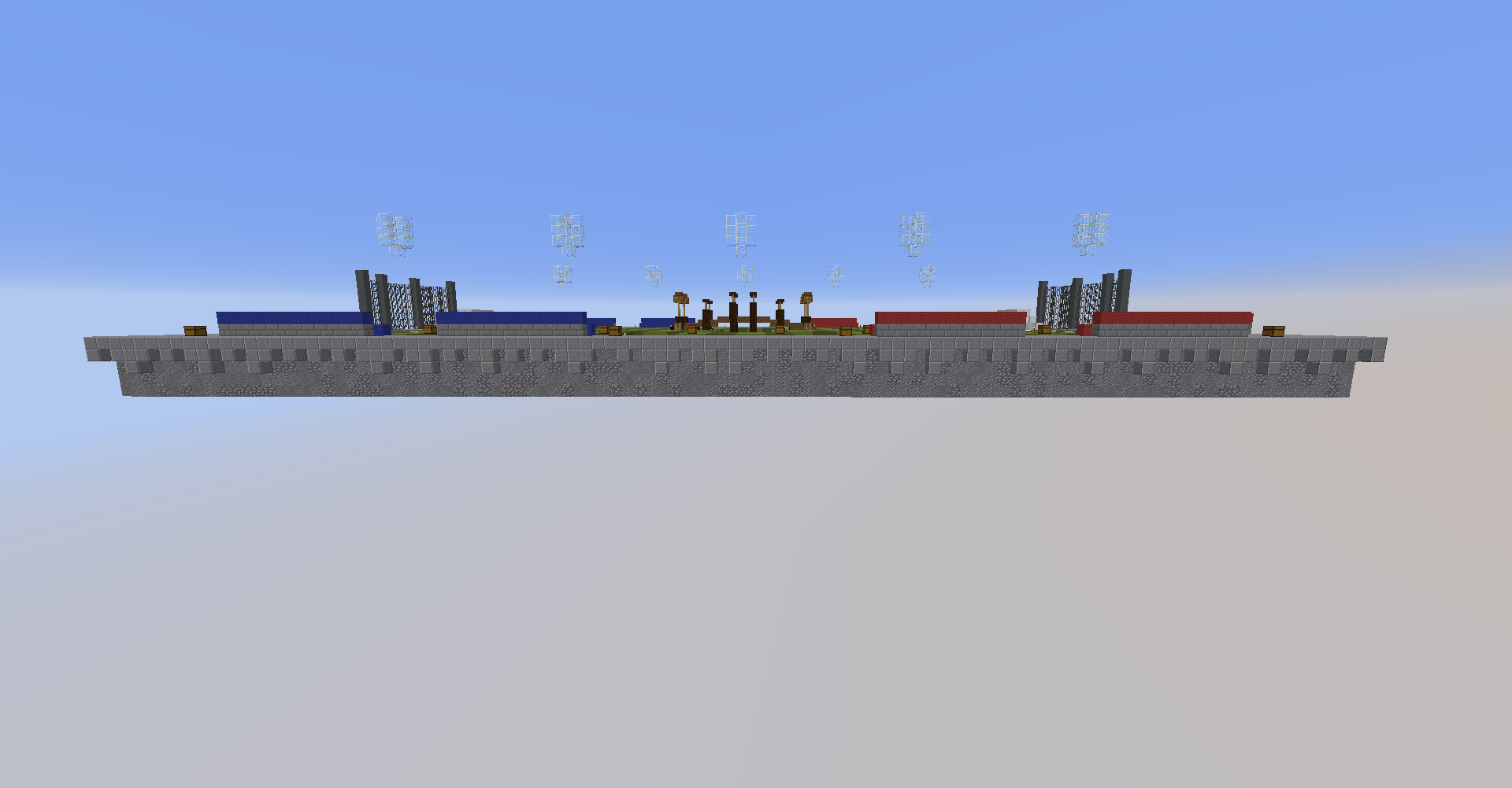
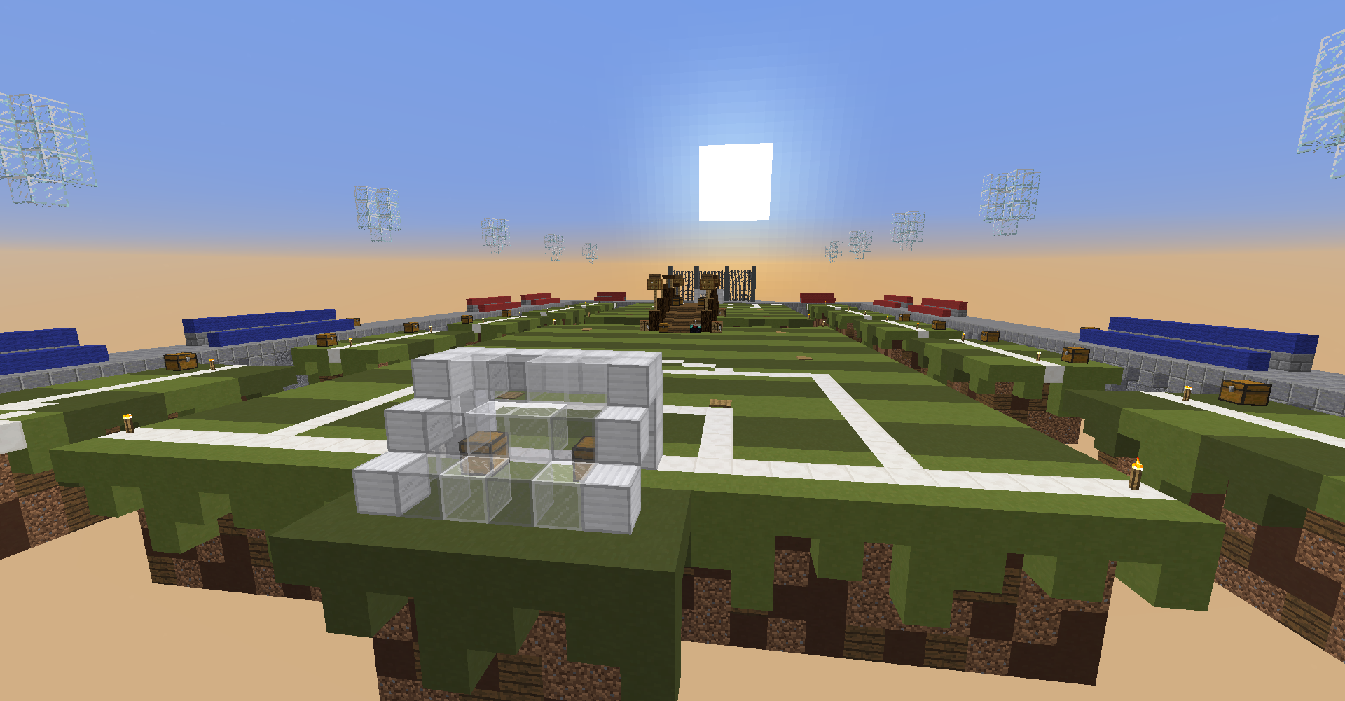
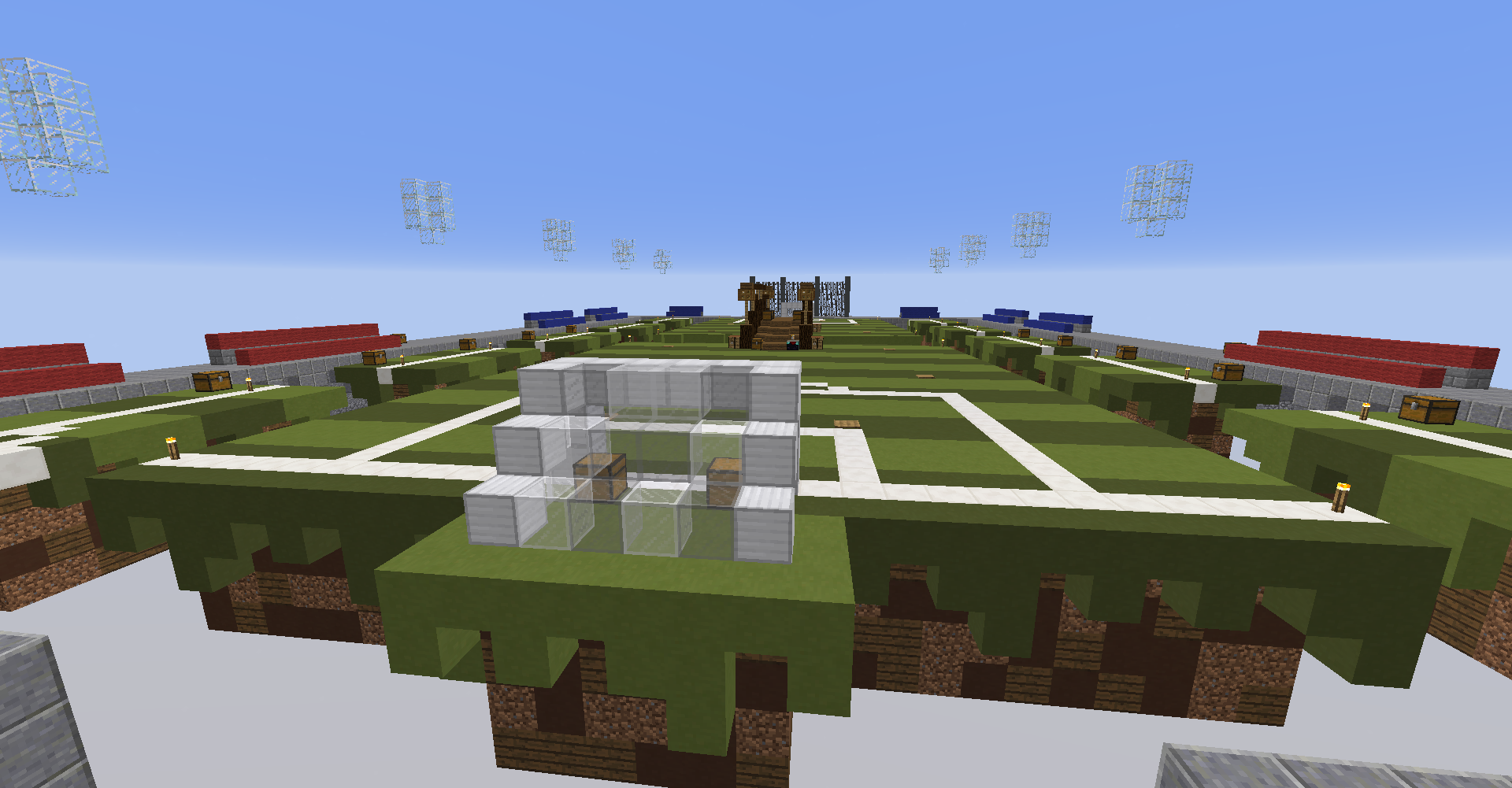
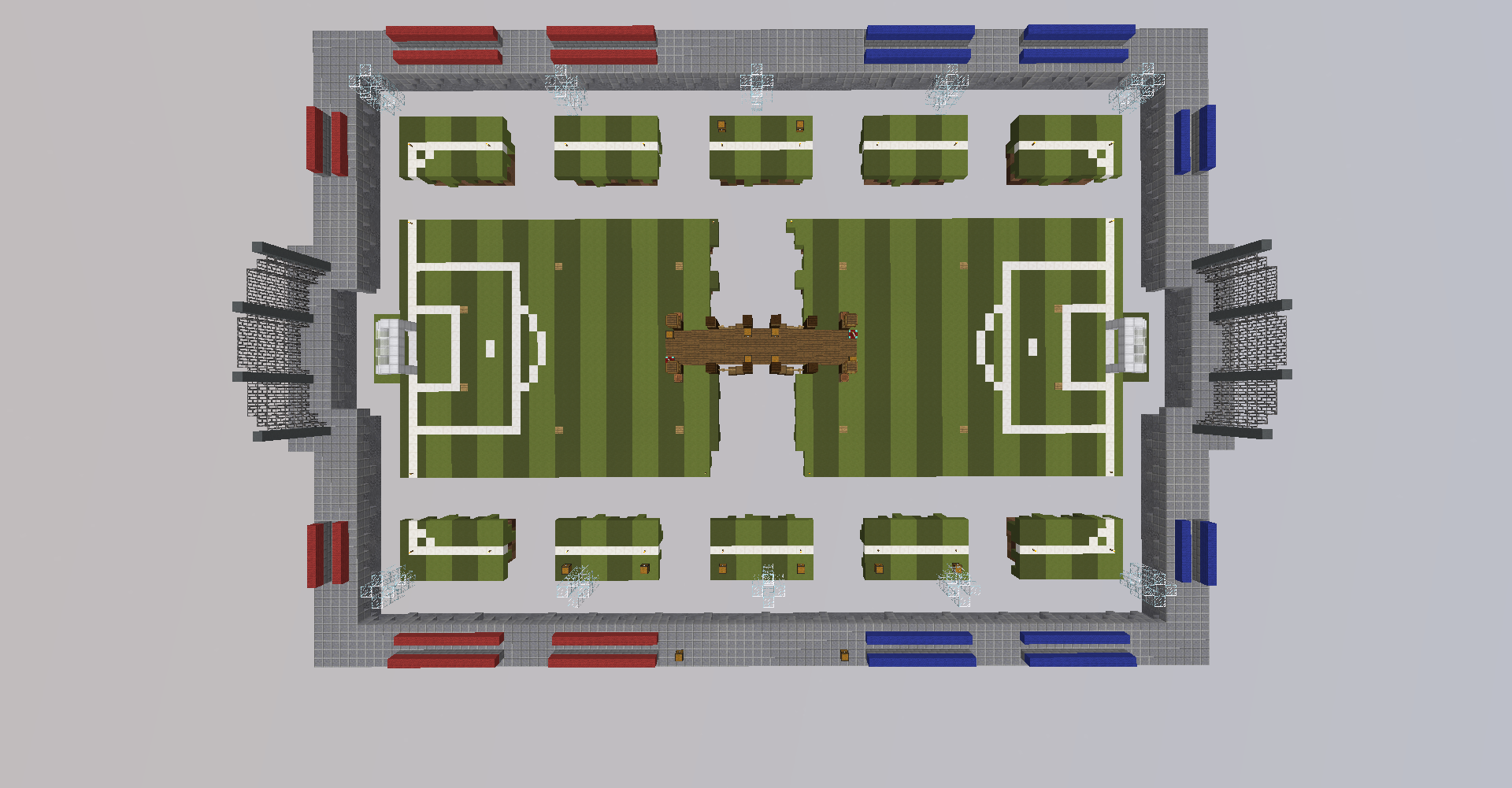
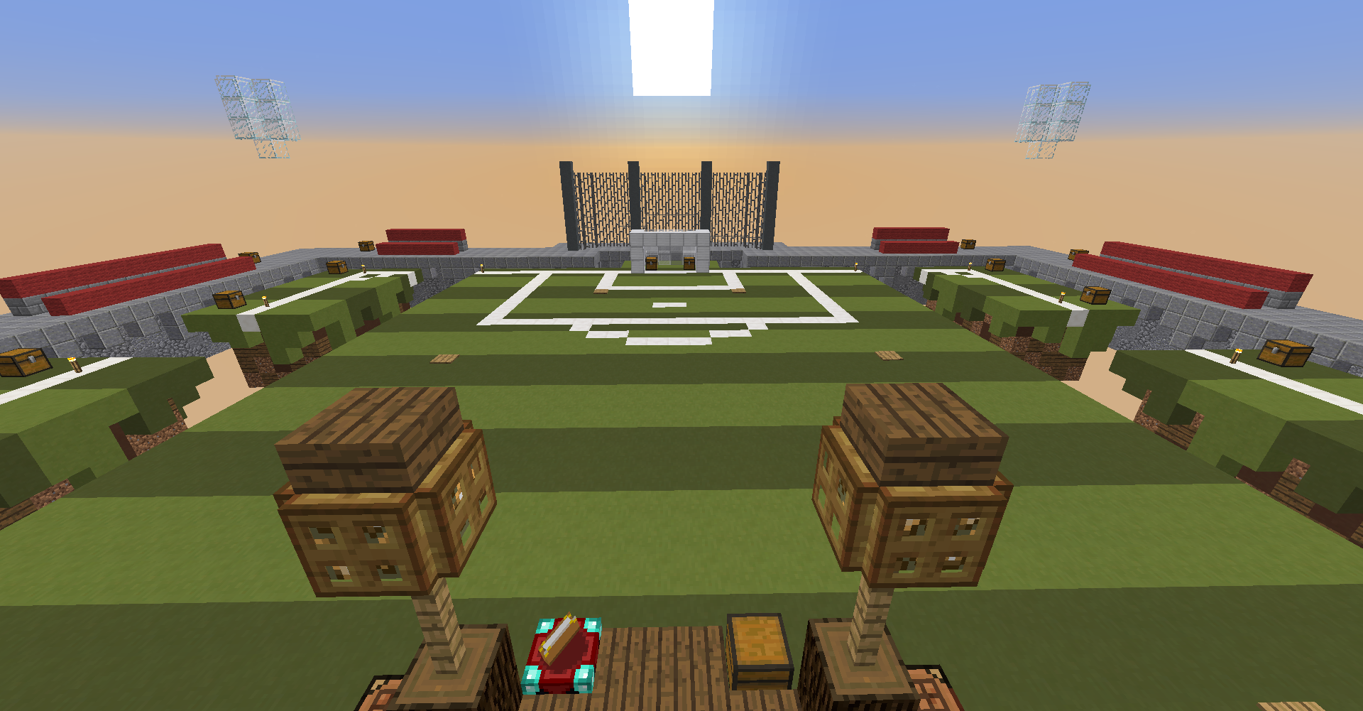
Field 2.0 is a re-build of the current Skywars map Field.
Players: 10 (Original field map has 12 players)
Chests start island: 2 (Also 2 on the current field map)
Chests outer ring (island): 12
Chests mid-island: 10
TNT traps on mid-island: 12 (Original has 21 I believe) - Each trap includes 1 wooden pressure plate and 2 TNT's.
Crafting Tables on mid-island: 4
Enchantment Tables on mid-island: 2
Extra: The 2 mid starter islands don't have any space to go directly to the mid-island so I've made space for them on the outer ring.
2020-03-19_23.45.16.png
2020-03-19_23.45.24.png
2020-03-19_23.45.35.png
2020-03-19_23.45.42.png
2020-03-19_23.45.54.png
2020-03-19_23.46.01.png
2020-03-19_23.46.10.png


_The13thDoctor_

Forum Professional
Jul 23, 2016
6,085
14,284
629
20
Chicago, Illinois
www.cubecraft.net
Pronouns
He/Him
(Note: I really like the current "Field" map and I think it's amazing to play on it! The reason I made a 2.0 version is because I really like football and wanted to give it a go!)

MAP NAME
Field 2.0

MAP CREATOR
Axyy

MAP DESCRIPTION
Field 2.0 is a re-build of the current Skywars map Field.
Players: 10 (Original field map has 12 players)
Chests start island: 2 (Also 2 on the current field map)
Chests outer ring (island): 12
Chests mid-island: 10
TNT traps on mid-island: 12 (Original has 21 I believe) - Each trap includes 1 wooden pressure plate and 2 TNT's.
Crafting Tables on mid-island: 4
Enchantment Tables on mid-island: 2
Extra: The 2 mid starter islands don't have any space to go directly to the mid-island so I've made space for them on the outer ring.


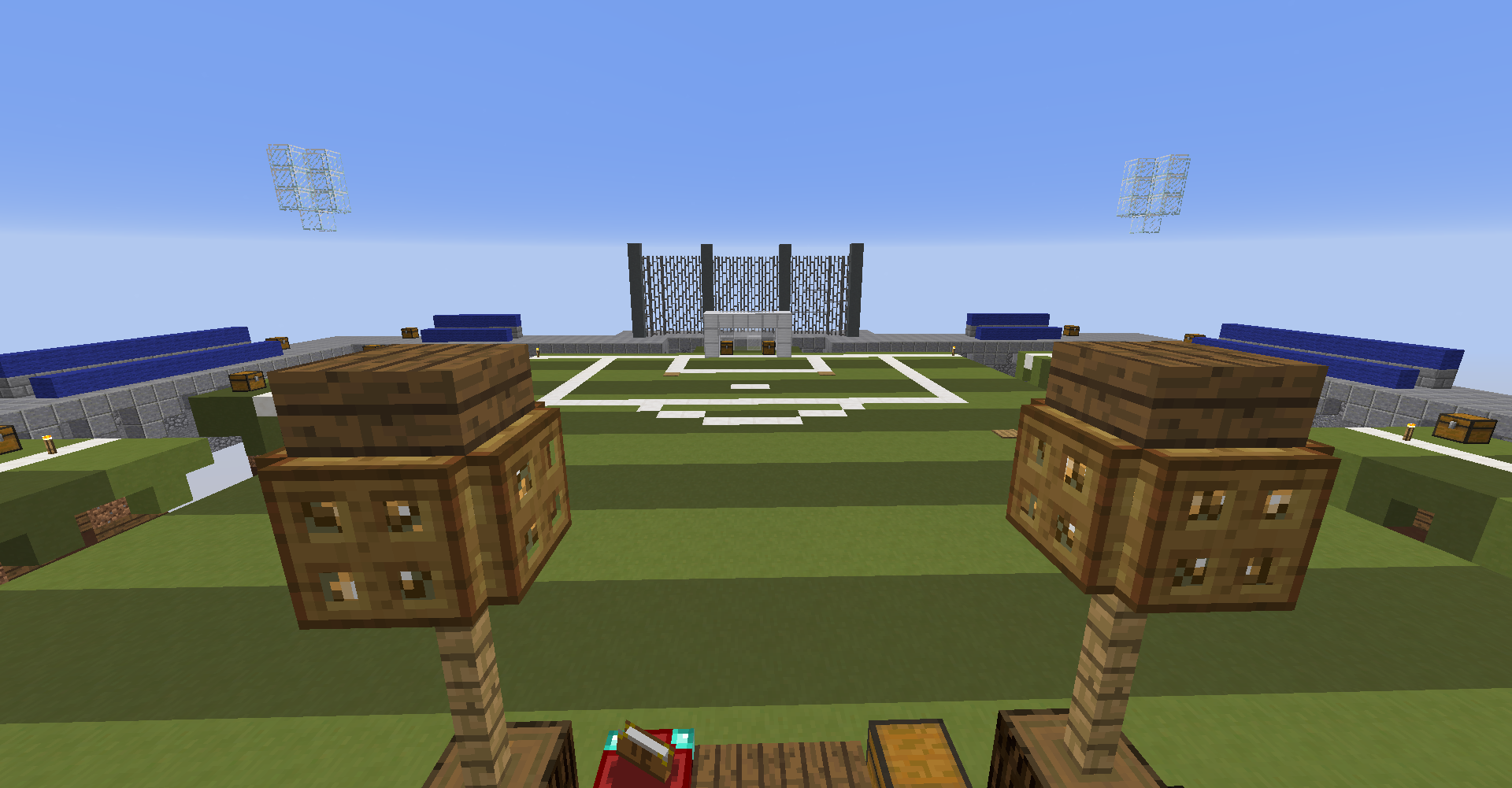
Hi, I dislike this map for many reasons and here is why: To start, It's underwhelming, you copy // pasted stuff and added some random weird stuff that's very out of place. It's not really up to standard with Cube. The map currently is amazing and this new version feels "lazy" and weird. The half middle or (outside middle) is very weird as it's stone and makes no sense. The bleachers are weird looking and the trees are gone which is really sad. The goals at the middle look, kind of bad, the weird bridge in the middle is so out of place and is an eye saur. And furthermore, the amount of chests is way to many, what really disappoints me is the traps, there out where no one would go, there supposed to be random and are supposed to make you look where you're going, now it's useless. The final thing I noticed was all the uses of lighting were really ugly looking and not necessary. In short, I do not like this map but I appreciate you submitting it. -1

Also, FYI I believe it were to be accepted, it would just be called Field since it would replace the original one, Field 2.0 just sounds weird not going to lie. :)

(Sorry if I sounded harsh but this is how I critique builds.) <3
 
  • Like
Reactions: Axyy

Nutuu

Forum Expert
Oct 7, 2017
667
2,078
349
Western Finland
Hey! I think the map looks cool and stuff but I prefer the current one.
I like in the current map there island around the map is green, in this version it looks a bit boring to me.
I also prefer having more players.
The bridge separating the two middle islands doesn't really fit into the theme.
I'm very tired right now so idk did I bring up all the points I was about to.

TLDR; Great remake but I prefer the current one. :)
 
  • Like
Reactions: Axyy

Axyy

Forum Expert
Oct 18, 2016
767
3,739
384
Gone
www.cubecraft.net
Hi, I dislike this map for many reasons and here is why: It's underwhelming, you copy // pasted stuff and added some random weird stuff that's very out of place. The map currently is amazing and this new version feels "lazy" and weird. The half middle or (outside middle) is very weird as it's stone and makes no sense. The bleachers are weird looking and the trees are gone which is really sad. The goals at the middle look, kind of bad, the weird bridge in the middle is so out of place and is an eye saur. And furthermore, the amount of chests is very disappointing, what really disappoints me is the traps, there out where no one would go, there supposed to be random and are supposed to make you look where you're going, now it's useless. The final thing I noticed was all the uses of lighting were really ugly looking and not necessary. In short, I do not like this map but I appreciate you submitting it. -1

Also, FYI I believe it were to be accepted, it would just be called Field since it would replace the original one, Field 2.0 just sounds weird not going to lie. :)

(Sorry if I sounded harsh but this is how I critique builds.) <3

Thanks for your feedback it's really not harsh at all! I completely understand what you're saying! :)
I do have some things to say so,
  • About the stone, I really think it does make sense since I wanted to create a little stadium and it wouldn't make sense if the seats were on grass. (Just wanted to try something new).
  • In my opinion, there's no such problem with the goals on mid-island, just tried to recreate a kind of goal which actually gets used in real life. (Triangle)
  • The bridge could need some help, I agree with you on this one.
  • About the traps, I also agree with you after I took another look at it. Having randomized traps just makes it harder for everyone while fighting.
  • There could be a bit more chests in the middle, but the chests on the start islands and the stone ring look fine to me.
  • When placing the lightning I already found it looking weird but I wanted to get some lightning in case if there's a game in night mode.
  • Thanks, I'm happy you appreciate the fact that I submitted it. This is just something I wanted to do and It really does not matter to me whether it gets accepted or not. I just wanted to give it a go and have some fun :P
 

Axyy

Forum Expert
Oct 18, 2016
767
3,739
384
Gone
www.cubecraft.net
Hey! I think the map looks cool and stuff but I prefer the current one.
I like in the current map there island around the map is green, in this version it looks a bit boring to me.
I also prefer having more players.
The bridge separating the two middle islands doesn't really fit into the theme.
I'm very tired right now so idk did I bring up all the points I was about to.

TLDR; Great remake but I prefer the current one. :)

Thanks for the feedback, the current map is great to play on :)
 
  • Like
Reactions: Nutuu

_The13thDoctor_

Forum Professional
Jul 23, 2016
6,085
14,284
629
20
Chicago, Illinois
www.cubecraft.net
Pronouns
He/Him
Thanks for your feedback it's really not harsh at all! I completely understand what you're saying! :)
I do have some things to say so,
  • About the stone, I really think it does make sense since I wanted to create a little stadium and it wouldn't make sense if the seats were on grass. (Just wanted to try something new).
  • In my opinion, there's no such problem with the goals on mid-island, just tried to recreate a kind of goal which actually gets used in real life. (Triangle)
  • The bridge could need some help, I agree with you on this one.
  • About the traps, I also agree with you after I took another look at it. Having randomized traps just makes it harder for everyone while fighting.
  • There could be a bit more chests in the middle, but the chests on the start islands and the stone ring look fine to me.
  • When placing the lightning I already found it looking weird but I wanted to get some lightning in case if there's a game in night mode.
  • Thanks, I'm happy you appreciate the fact that I submitted it. This is just something I wanted to do and It really does not matter to me whether it gets accepted or not. I just wanted to give it a go and have some fun :p

  • Stone dosen't fit as there is no stadium it just dosen't look right.
  • The goals look god awful, sorry but the ones that exist in the original one are simplistic but look real.
  • Honestly, there shouldn't be a bridge at all last time I checked soccer fields don't have bridges. xP
  • Yes.
  • 12 chests for the ring, that's a lot dude I think there are too many.
  • Also, a lot of maps don't have light and they get by fine the point is it stands out and looks weird.
 
  • Like
Reactions: Axyy and Nutuu

Axyy

Forum Expert
Oct 18, 2016
767
3,739
384
Gone
www.cubecraft.net
  • Stone dosen't fit as there is no stadium it just dosen't look right.
  • The goals look god awful, sorry but the ones that exist in the original one are simplistic but look real.
  • Honestly, there shouldn't be a bridge at all last time I checked soccer fields don't have bridges. xP
  • Yes.
  • 12 chests for the ring, that's a lot dude I think there are too many.
  • Also, a lot of maps don't have light and they get by fine the point is it stands out and looks weird.

Can't agree with you on the goals, they are a bit small but in my opinion, they look realistic. :P (It's okay to have different opinions)
 

LordSidi0us

Forum Expert
Mar 1, 2019
2,447
2,096
254
Coruscant
The already existing version is pretty simple but not basic.
I think your version has potential and it’s not bad, but it should be detailed more.
 
  • Like
Reactions: Axyy

MrTommy

Dedicated Member
Jul 3, 2019
429
7,645
239
Legoworld
www.instagram.com
Pronouns
He/Him
It looks great, but i think i like the other one more. i also would find it horeble to be at the middel Island, you will need to bridge right to the edge to bridge to mid. Also it would be imposeble to kock people of at the outside ring because at place there is a 2 block high wall
 
  • Like
Reactions: Axyy

Efcluke94

👀
Team CubeCraft
💙 Admin Team
🎨 Designer
Oct 20, 2013
3,000
9,465
678
Hello Axyy thank you for your efforts in submitting this.

Unfortunately, collectively the design team have decided to deny this map submission due to the following reasons:

- The design team and what seems to be the community (6 yes and 11 no) prefer the current version, so we will be sticking with that.
- Me personally I'd rather see a completely original theme or concept in future map submissions

Please do not be disheartened by the above comments and take some of the advice on board if you wish to submit another map in future, thanks!
 
Status
Not open for further replies.
Members Online

Members online

Latest profile posts

TheOrderOfSapphire wrote on Xi1m's profile.
Hello Acra, how are you?:D
TheOrderOfSapphire wrote on katnip's profile.
Cool profile picture!:D
Top Bottom