Minecraft PC IP: play.cubecraft.net

Should this map be implemented?


  • Total voters
    15
  • Poll closed .
Status
Not open for further replies.

Wave Master7S

Dedicated Member
Jul 31, 2020
821
1,616
244
United States
Pronouns
He/Him
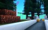
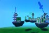
Science Fiction is a map of what humanity could look like in a few hundred years.Its a space faring civilization.
Theres a space habitat in middle, a tower at semi middle, and some image creators on the the spawn island.
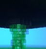
Level of Generators
Middle- level 2 gold gen, level 2 diamond gen, broken emerald gen.
Semi Middle- level two gold and iron gen.
Spawn Islands- 1 level 2 iron gen and another level 1 iron gen, and a level 1 gold gen.

Last map for a while.
Comment for feedback thank you.
 

Attachments

  • FB789975-F869-4E6A-B75C-4C5DF8852EB2.jpeg
    FB789975-F869-4E6A-B75C-4C5DF8852EB2.jpeg
    566.1 KB · Views: 133
  • 8ACFC57B-C4C9-4D3D-8550-845C8CC068AF.jpeg
    8ACFC57B-C4C9-4D3D-8550-845C8CC068AF.jpeg
    533 KB · Views: 120
  • 0491FFF3-7307-4C76-8927-D1CC3455C0E4.jpeg
    0491FFF3-7307-4C76-8927-D1CC3455C0E4.jpeg
    482.3 KB · Views: 117
  • 7DF13512-33D5-4508-A4DD-10B5A3CC449E.jpeg
    7DF13512-33D5-4508-A4DD-10B5A3CC449E.jpeg
    436.7 KB · Views: 121
  • C85FDF12-CEBA-4477-B43B-C3BB8FC79C83.jpeg
    C85FDF12-CEBA-4477-B43B-C3BB8FC79C83.jpeg
    537.4 KB · Views: 113
  • 89605D0D-8098-474C-A909-C765CAD931C4.jpeg
    89605D0D-8098-474C-A909-C765CAD931C4.jpeg
    511.2 KB · Views: 109
  • 605BA7E7-F987-4B5E-82F1-3DF014B309E0.jpeg
    605BA7E7-F987-4B5E-82F1-3DF014B309E0.jpeg
    498.4 KB · Views: 124
  • 2B482FEC-D1EB-4CF8-8685-18F99A58B1A9.jpeg
    2B482FEC-D1EB-4CF8-8685-18F99A58B1A9.jpeg
    198.4 KB · Views: 99
  • C009D6FE-EC76-4F5C-A1B9-53166464C8EA.jpeg
    C009D6FE-EC76-4F5C-A1B9-53166464C8EA.jpeg
    343.1 KB · Views: 116
  • Like
Reactions: Hinterglemmer

luv!

Well-Known Member
Apr 13, 2020
397
513
109
17
Toronto, Ontario.
Although I can notice the immense effort put into this, I don't really like it. Heres why:
1. The islands themselves are way too plain; consisting of a single chunk of block partially molded into the shape we see in the screenshots.
2. The structures on the island look nice but the island still lacks a lot of detail on the island. Its right now just terracotta with a couple sea lanterns.
3. Everything is too close together. The islands to the pre-mid are just around 10 blocks at most which is way too close in my opinion.
4. The trees at mid along with the base can use a lot of improvement and refinement. Right now they look too generic. I'm also not sure how they fit in with the rest of the map. Using a coherent style all over the map would look nicer.
Overall, I think you did a good job, however, a lot of enhancements should be made in order to have the best possible results. I'm no builder what-so ever, this is just my opinion.

Keep up the good work, and always strive to do better!
:))

Edit: Is it also possible that you can give us better screenshots? Thanks.
 

FnigePython

Well-Known Member
Sep 7, 2019
603
452
79
20
the land down under
Pronouns
She/Her
I dont mind the look, you could have some variation of blocks in the floors and underneath but oh my god please take better pictures we dont mind if we see your 12.74 inch radius spider over in the corner of the TV


If you have to take pictures, you can have your TV Bezels show, we dont mind i hope
 
  • Like
Reactions: Gregeyy and wxzzrd

_The13thDoctor_

Forum Professional
Jul 23, 2016
6,085
14,282
629
20
Chicago, Illinois
www.cubecraft.net
Pronouns
He/Him
Although I can notice the immense effort put into this, I don't really like it. Heres why:
1. The islands themselves are way too plain; consisting of a single chunk of block partially molded into the shape we see in the screenshots.
2. The structures on the island look nice but the island still lacks a lot of detail on the island. Its right now just terracotta with a couple sea lanterns.
3. Everything is too close together. The islands to the pre-mid are just around 10 blocks at most which is way too close in my opinion.
4. The trees at mid along with the base can use a lot of improvement and refinement. Right now they look too generic. I'm also not sure how they fit in with the rest of the map. Using a coherent style all over the map would look nicer.
Overall, I think you did a good job, however, a lot of enhancements should be made in order to have the best possible results. I'm no builder what-so ever, this is just my opinion.

Keep up the good work, and always strive to do better!
:))

Edit: Is it also possible that you can give us better screenshots? Thanks.

Very close to what I was going to say and I agree with all your points.

The swords also don't make to much sense and the detailing is plain and could use some work. Everything needs to be spaced out as well. I'll give more feedback as you update.
 

wxzzrd

Dedicated Member
May 30, 2020
1,924
1,710
204
First of all I can barely see the map u need much better screenshots. Second of all it’s not detailed enough and the trees are waaaay out of place
 
  • Like
Reactions: Gregeyy and luv!

Exarpo

Well-Known Member
Jun 29, 2019
357
361
79
Good idea, but there are things you could improve.
First of all, are the glass-swords ment to be "shot" from the cannons? If yes you should make them more aligned with the cannon.
Also the shape of the islands is a bit weird imo, either make it more natural-looking or make it completely rectangular.
 
  • Like
Reactions: Gregeyy and luv!

Hinterglemmer

Well-Known Member
Nov 2, 2018
57
150
84
19
Belgium
There is potential in it. But as others have said, there is some detail missing. So with some adjustments and more detail this can become a cute map. Keep it up! 😉
 
  • Like
Reactions: Gregeyy

Gregeyy

Forum Expert
Jul 21, 2017
808
2,472
349
Spain
Hey!

First of all, thanks for your effort, I really appreciate your work.
However, as many people said above, there's an significant lack of detail on your map.

Don't worry though! With some improvement, you still have the chance to see your map implemented in the future.
I advise you to add a poll so the people can vote and express their opinion easily.

Have a nice day! :heart:
 

Harkeann

Member
Apr 10, 2020
13
7
4
25
Хотя я могу заметить, какие огромные усилия были приложены к этому, мне это не очень нравится. Вот почему:
1. Сами острова слишком просты; состоящий из одного куска блока, частично сформированного в форму, которую мы видим на скриншотах.
2. Строения на острове выглядят красиво, но острову по-прежнему не хватает деталей. Сейчас это просто терракота с парой морских фонарей.
3. Все слишком близко друг к другу. Острова до пре-мида находятся не более чем в 10 кварталах, что, на мой взгляд, слишком близко.
4. Деревья в середине вместе с основанием можно улучшить и усовершенствовать. Сейчас они выглядят слишком банально. Я также не уверен, как они вписываются в остальную часть карты. Было бы лучше использовать единый стиль на всей карте.
В целом, я считаю, что вы проделали хорошую работу, однако для достижения наилучших результатов необходимо внести множество улучшений. Я вообще не строитель, это всего лишь мое мнение.

Продолжайте в том же духе и всегда стремитесь делать лучше!
:))

Изменить: возможно ли, что вы можете дать нам лучшие скриншоты? Спасибо.
cool, thanks for the feedback and recommendation.
 
  • Angry
Reactions: Wave Master7S
Status
Not open for further replies.
Members Online

Team online

Members online

Latest profile posts

qKhalidd wrote on ignsinf's profile.
Hi
TheOrderOfSapphire wrote on ii6xxq's profile.
welcome to the forums! I hope you will have a nice stay here:D
This is YOUR daily dose of facts #41-
The moon has moonquakes, which are kind of like the earthquakes on the Earth, but weaker.
Basketman wrote on Eli's profile.
Favourite how to tame a dragon movie, shoot.
Reesle wrote on ii6xxq's profile.
Welcome to the Official Cubecraft Forums!! Hope you enjoy your stay :)
Top Bottom