Minecraft PC IP: play.cubecraft.net

Would you like to see this map?


  • Total voters
    38
Status
Not open for further replies.

_The13thDoctor_

Forum Professional
Jul 23, 2016
6,085
14,283
629
20
Chicago, Illinois
www.cubecraft.net
Pronouns
He/Him
Hey, everyone! It cost me an arm and a leg but I finally finished this map. I'm not worried about school because I'm getting high SEAS. Anyways here it is, my first submission!

- Map name: Pirates
- Creator(s) of the map: @_The13thDoctor_
- Description of map: The Red and Blue ship captains clash in a duel for the special treasure under the buried treasure. The map is surrounded by giant rocks accompanied by 2 massive ships and a small but crab filled island with your occasional bird. Most of the fighting will take place on the sea with a chance to fight on the decks, to the island, to the rocks above.

https://imgur.com/a/GMMXqVT

Feedback is very much appreciated! Good or bad, I'd like to hear it! Please, however, vote based on how much you like the map gameplay and style-wise, keep in mind this is going to be a map for everyone so don't vote if you want to be a troll or you don't like me.

Special Thanks:
@Elivat
@Nutuu for giving me the ship to modify and rebuild.
@SanCookie for his advice and criticism.
@Yoya for showing me a lot of world edit techniques and helping me learn how do make certain things

What do pirates like to do at school? Arrrrrrrrrt!
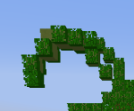
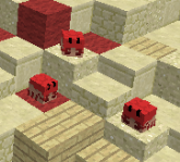
 
Last edited by a moderator:

Priley

Forum Professional
Jul 6, 2015
4,118
16,203
679
21
reprotland
@FireExcalibur10 I've seen you voting against a handful of maps but you rarely ever explain yourself. Mind giving Doc and Eli some tips? :)

Personally, I hate the border wall (rocks) because they look really messy: both colour-wise speaking as shape-wise. It looks like //brush sphere without much of smoothening to them. There are way too many different blocks as well. I would have used stone, andesite and perhaps some gravel and buttons to add more detail
RLPWtiU.png


I'm not the best if it comes to building ships and such, but I'm sure this isn't exactly right. It stretches out way too far and way too high
I7J9Ycf.png


I definitely think the ships should be moved downwards by a block to prevent players from staying on their ship and knocking back their opponent all the time
dWm8XYA.png


This palm leaf looks odd and unnatural
JBhMtX6.png


These heads will undoubtedly get in the way of the battle and should be removed
JbMvjom.png


I like the idea and overall execution, it's just the small details that could've been done better - imo
The feedback I gave is all from my own perspective and my own opinion! :)
Hope it can help!
 

_The13thDoctor_

Forum Professional
Jul 23, 2016
6,085
14,283
629
20
Chicago, Illinois
www.cubecraft.net
Pronouns
He/Him
Yes but the only thing I would change is the height of the island. Lower it down to 2 blocks perhaps cause at its current state, people can easily get the highground and keep knocking the enemy back.

It really not that big of a difference because both players can reach there at the same time it’s just who hits first. I have seen maps with the high ground but even worse. I could change it but that would make the island weird.

@FireExcalibur10 I've seen you voting against a handful of maps but you rarely ever explain yourself. Mind giving Doc and Eli some tips? :)

Yes.

Personally, I hate the border wall (rocks) because they look really messy: both colour-wise speaking as shape-wise. It looks like //brush sphere without much of smoothening to them. There are way too many different blocks as well. I would have used stone, andesite and perhaps some gravel and buttons to add more detail
RLPWtiU.png


I'm not sure I showed this but I did smooth it out more on the inside, this is an outside shot and tbh that won't matter so much because the only people wandering there will most likely die soon. I will add buttons, but they're supposed to be messy. Since when should rocks be clean? There rocks, random and could be anything.

I'm not the best if it comes to building ships and such, but I'm sure this isn't exactly right. It stretches out way too far and way too high
I7J9Ycf.png


It's the style, I could fix it but then the rest of the ship would look a bit weird.

I definitely think the ships should be moved downwards by a block to prevent players from staying on their ship and knocking back their opponent all the time
dWm8XYA.png

Would you like me to add a natural or unnatural entrance to combat this? Downwards will make it super weird like it's sinking.

This palm leaf looks odd and unnatural
JBhMtX6.png


I will fix that.

These heads will undoubtedly get in the way of the battle and should be removed
JbMvjom.png


It's a small detail that's purposely placed in an area where people won't normally be. I can move them but Snap, Crackle, and Pop are here to stay.


I like the idea and overall execution, it's just the small details that could've been done better - imo
The feedback I gave is all from my own perspective and my own opinion! :)
Hope it can help!

Thanks for the feedback!

Wow! Would like to see this on cubecraft, nice job!

Thanks! <3

I really like this map! :)
Thanks! <3


Thanks! <3

Update Coming Soon!
 
  • Like
Reactions: Priley

Haighers112

Member
Jul 5, 2019
52
57
19
It's a very well built map and looks like something that would already be on CubeCraft, unsure as to why people have voted a no without putting a reason.. It would be the decent thing to put some reasons why you voted no and what the builders can do to make it better in your eyes.
 
  • Like
Reactions: _The13thDoctor_

_The13thDoctor_

Forum Professional
Jul 23, 2016
6,085
14,283
629
20
Chicago, Illinois
www.cubecraft.net
Pronouns
He/Him
It's a very well built map and looks like something that would already be on CubeCraft, unsure as to why people have voted a no without putting a reason.. It would be the decent thing to put some reasons why you voted no and what the builders can do to make it better in your eyes.

One of the no reasons why people is a builder. :eyes:
 
  • Like
Reactions: Haighers112

FireExcalibur10

Forum Expert
Jul 3, 2016
973
1,890
293
23
Andromeda
Oh ye sorry I forgot to reply xd. Basicly is what Riley showed at the photos. Try removing that red heads and add a light brown ones like sandstone. As for the palette of the edges, make it with a darker grey tone.
 

_The13thDoctor_

Forum Professional
Jul 23, 2016
6,085
14,283
629
20
Chicago, Illinois
www.cubecraft.net
Pronouns
He/Him
Oh ye sorry I forgot to reply xd. Basicly is what Riley showed at the photos. Try removing that red heads and add a light brown ones like sandstone. As for the palette of the edges, make it with a darker grey tone.

Those read heads are crabs. For the rocks I’m currently working on that. What blocks do you suggest?
 
  • Like
Reactions: FireExcalibur10

Nutuu

Forum Expert
Oct 7, 2017
667
2,078
349
Western Finland
@FireExcalibur10 I've seen you voting against a handful of maps but you rarely ever explain yourself. Mind giving Doc and Eli some tips? :)

Personally, I hate the border wall (rocks) because they look really messy: both colour-wise speaking as shape-wise. It looks like //brush sphere without much of smoothening to them. There are way too many different blocks as well. I would have used stone, andesite and perhaps some gravel and buttons to add more detail
RLPWtiU.png


I'm not the best if it comes to building ships and such, but I'm sure this isn't exactly right. It stretches out way too far and way too high
I7J9Ycf.png


I definitely think the ships should be moved downwards by a block to prevent players from staying on their ship and knocking back their opponent all the time
dWm8XYA.png


This palm leaf looks odd and unnatural
JBhMtX6.png


These heads will undoubtedly get in the way of the battle and should be removed
JbMvjom.png


I like the idea and overall execution, it's just the small details that could've been done better - imo
The feedback I gave is all from my own perspective and my own opinion! :)
Hope it can help!
The ship is actually built over 1.5 years ago xD
 
  • Like
Reactions: _The13thDoctor_
Status
Not open for further replies.
Members Online

Members online

Latest posts

Latest profile posts

Otherworld wrote on RobinDn's profile.
Thank you for the follow!
UncleSpect wrote on GiGaGekkies's profile.
You are amazing <3
GiGaGekkies wrote on Ferrcho's profile.
Ola! Happy Birthday! :)
GiGaGekkies wrote on Roxlad's profile.
Happy Birthday <3
Top Bottom