Minecraft PC IP: play.cubecraft.net

Would you like to see this?

  • Yes

    Votes: 1 16.7%
  • No (please explain)

    Votes: 5 83.3%

  • Total voters
    6

Ducky

Forum Professional
Dec 31, 2015
4,700
6,709
559
22
The Netherlands
Hello everyone, it's me again,

I want to suggest to add the level progress in perecente between brackets in the sidebar. This is the sidebar I'm talking about:

60f308732d3f37855182c7b4ffb7bc93.png


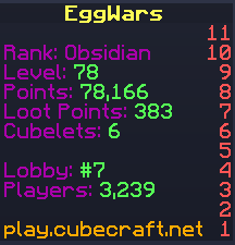
I know, it's not the most important thing to add right now, but the sidebar is quite new, so why not improve it now? And your level is in the sidebar, so why not add your progress (in percentage) too?

So it'd become something like this:
Level: 78 (9,5%)

Let me know your opinions below!

Cya!
 
  • Like
Reactions: Dutudy

SanCookie

Gameplay Engineer
Mar 18, 2017
2,306
12,760
498
22
the selfie area
bit.ly
Pronouns
He/Him
Or just completely remove the leveling part, because why else is the experience bar there? I really don't like the fact that half of my screen is just information/advertising about the server now, so it'd be better if they remove as much as possible.

Oh and about the new book, at least hypixel made it toggable
It kinda already looks ugly enough to me. 2 clicks to see the same information really isn't too much to do, is it? Worst case scenario, you can just glance on your experience bar and estimate how close you are.
Same for the (loot) points, I think that sidebar is very unnecessary
 

Ducky

Forum Professional
Dec 31, 2015
4,700
6,709
559
22
The Netherlands
It kinda already looks ugly enough to me. 2 clicks to see the same information really isn't too much to do, is it? Worst case scenario, you can just glance on your experience bar and estimate how close you are.
Nope, it indeed isn't. But why did they add such a sidebar in general then? I know you can get the same information with 2 clicks or by tapping tab.
 

Gainfullterror

Forum Professional
Mar 24, 2016
5,040
10,898
624
22
Breakfast for Dinner Club HQ
www.cubecraft.net
Nope, it indeed isn't. But why did they add such a sidebar in general then? I know you can get the same information with 2 clicks or by tapping tab.
Why would I know?
As I said, I already think it's ugly, so I don't want it to exist in general. Adding even more to it is something I'd like to avoid.
The only proper use I could see for it is to add a date to it to prevent people from reporting with old screenshots. For the rest, everything is pretty pointless.
 
  • Like
Reactions: SanCookie

Ducky

Forum Professional
Dec 31, 2015
4,700
6,709
559
22
The Netherlands
Why would I know?
As I said, I already think it's ugly, so I don't want it to exist in general. Adding even more to it is something I'd like to avoid.
The only proper use I could see for it is to add a date to it to prevent people from reporting with old screenshots. For the rest, everything is pretty pointless.
I certainly agree with a date. What they also just could do is replace everything inside that sidebar with only the date and maybe the time. Maybe that's an idea.
 

Gainfullterror

Forum Professional
Mar 24, 2016
5,040
10,898
624
22
Breakfast for Dinner Club HQ
www.cubecraft.net
I certainly agree with a date. What they also just could do is replace everything inside that sidebar with only the date and maybe the time. Maybe that's an idea.
What I'm about to say kind of contradicts what I said previously, but this is more objective if anything: At that point, it'd also seem kind of random to have it. If they wanted to add a date to the thing alone, the least they could do is add some more general information to make it appear as a useful tool.
 
  • Like
Reactions: Ducky
Members Online

Team online

Members online

Latest posts

Latest profile posts

Critly wrote on Kloska's profile.
Happy Birthday, enjoy your day! 🎉
Basketman wrote on Kloska's profile.
Happy Birthday mister Ducky 🎉🥳
BurgerCat13 wrote on Kloska's profile.
Happy birthday Kloskyy!!!
𝑷𝑹𝑶 𝑾𝑰𝑵𝑵𝑨𝑨𝑹 wrote on Kloska's profile.
Happy bday 🥳
Xi1m wrote on Kloska's profile.
happy birthday!!
Top Bottom