Minecraft PC IP: play.cubecraft.net

Should this map be added?

  • Yes

    Votes: 28 51.9%
  • No

    Votes: 26 48.1%

  • Total voters
    54
Status
Not open for further replies.

Skoedel

Dedicated Member
Apr 14, 2019
348
1,058
174
Belgium
(note: this is our first time creating a map)

MAP NAME:
Aqua

MAP CREATORS:
@Anneum & @Skoedel

DESCRIPTION:
Players: 12

Chests start island: 3

Chests ring: 3
Chests mid island: 11


PICTURES:
GcF3v6q.png
k3dI9Jh.png
tXlr0lr.png
YFV5ajK.png
ZBHMgEL.png
wopeBQZ.png
WCogA3r.png
PsITnQB.png
m9s3rBx.png
d14Ir7e.png
Sn5UnTD.png
hi9BH2j.png

(Thanks @GiGaGekkies , @Rawrbin , @EasyStoeptegel, @Froedel for helping with some details)
 
Last edited:

Fesa

Quality Assurance
Team CubeCraft
🧪 Quality Assurance
Oct 17, 2016
1,505
4,014
349
Yoitsu
Pronouns
She/Her
I really like the map!
I just feel like it’s a copy of one of the easter maps with a different theme. Which isn’t bad of course!
I enjoy mid the most, with the water to protect you if you’re in mid mid.
One little thing, you have to upload the screenshots to the forums themselves, not use an imgur link. I have seen staff say this on a lot of submitted maps :)
 

Eli

Forum Veteran
Dec 25, 2017
1,279
6,505
408
18
Bogota, Colombia
I voted no, mainly because of aesthetics not gameplay. The starter islands are underdetailed, I don't know if you wanted to make the map look minimalistic but it doesn't really work out, the decorations are too small. I don't like the way the sand looks on top of the concrete, and the bottoms of the islands could use more detail as well. The layout of the map is really standard, nothing creative, and mid shouldn't be rectangular in my opinion. I don't like the shark in the middle, I'm not a good organics builder but it just doesn't look right. Overall while I like the theme you chose, I don't see how it would be up to standard compared to CubeCraft's builds, the quality is just not the same.
 

Diav

( ͡° ͜ʖ ͡°)
Jan 16, 2020
255
1,049
159
21
Venice
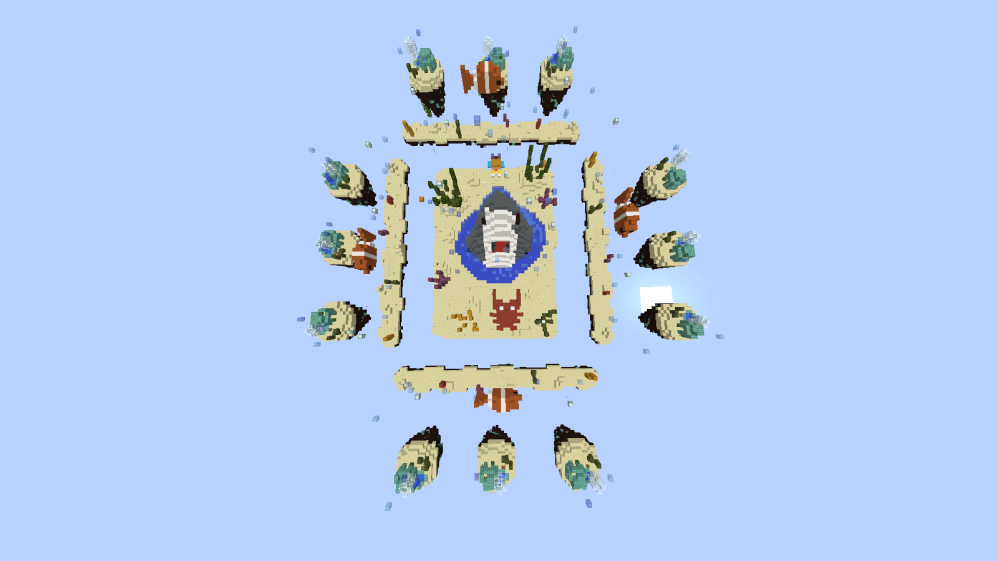
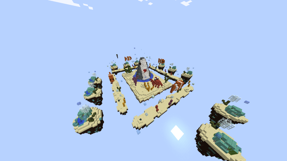
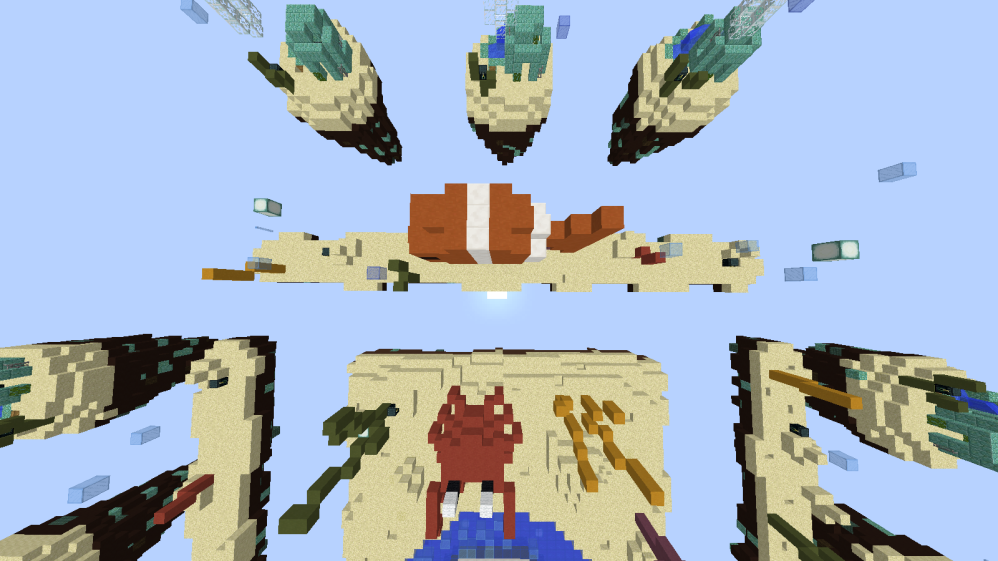
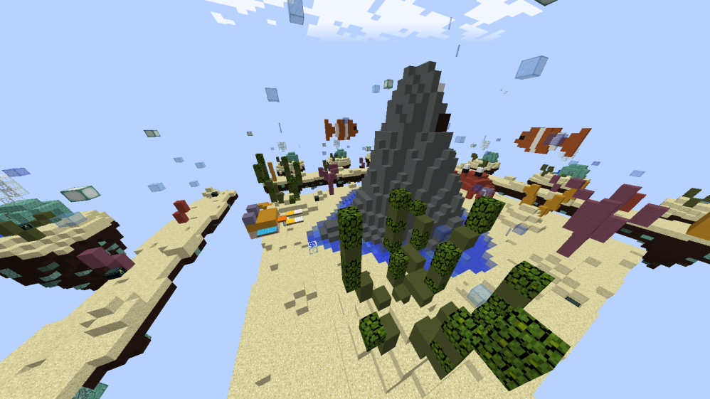
This is just a personal preference but, I feel like the "under the sea" theme became a bit boring, I've seen too many maps with that theme.

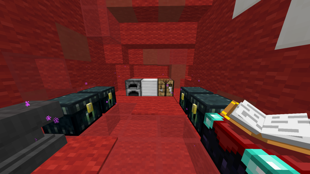
Also another thing I noticed is the shark in the middle, it reminds me a lot of the map 
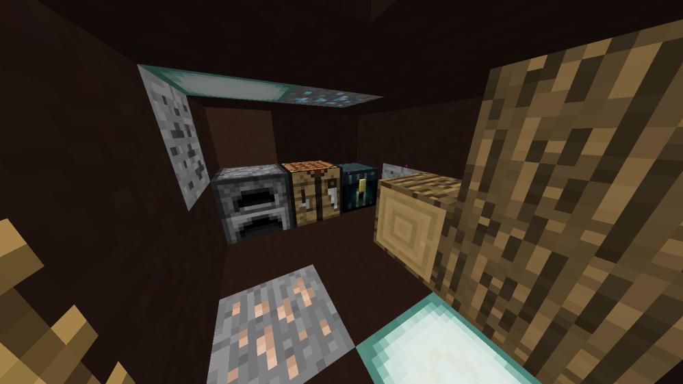
@ValeHundred made for Team skywars, which got accepted, and the fact that the shark comes out of the sand looks a bit weird to me. Anyways I think the shark is well done and I like the fact of putting fornitures inside its mouth.

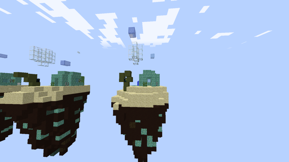
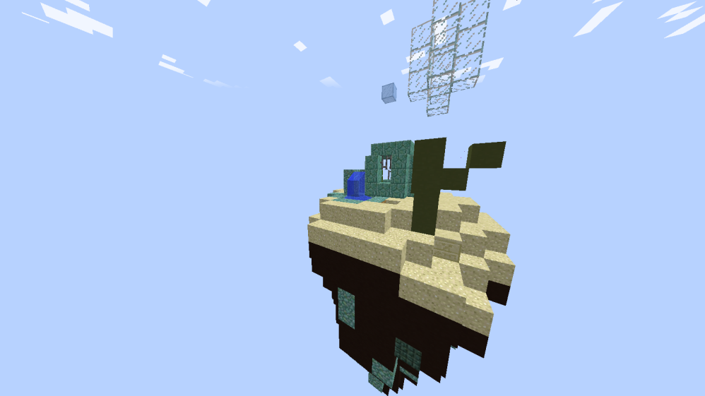
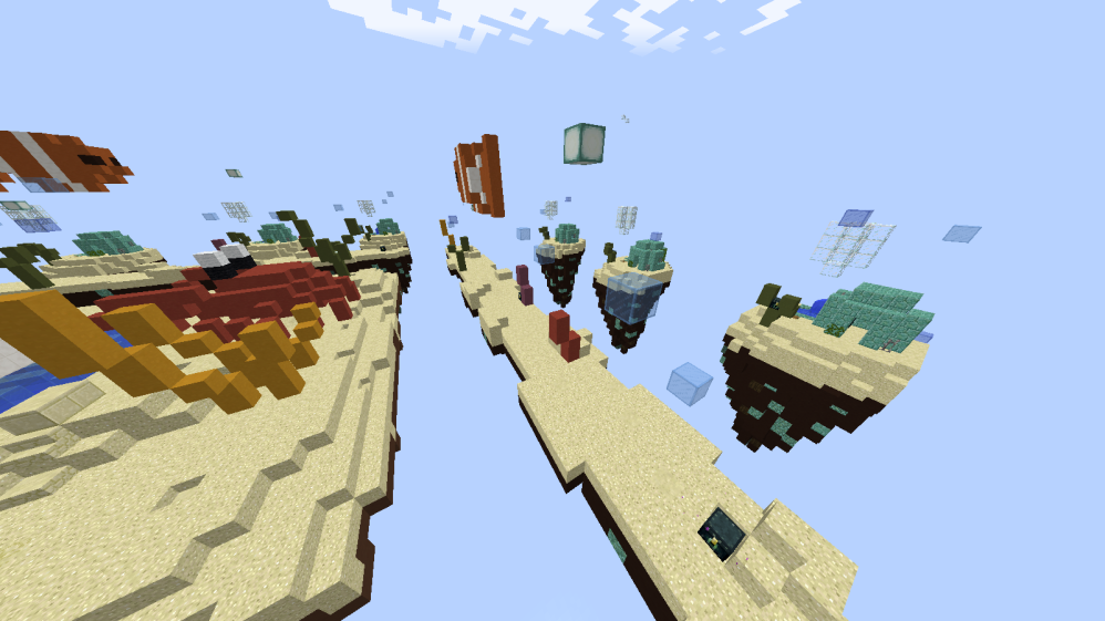
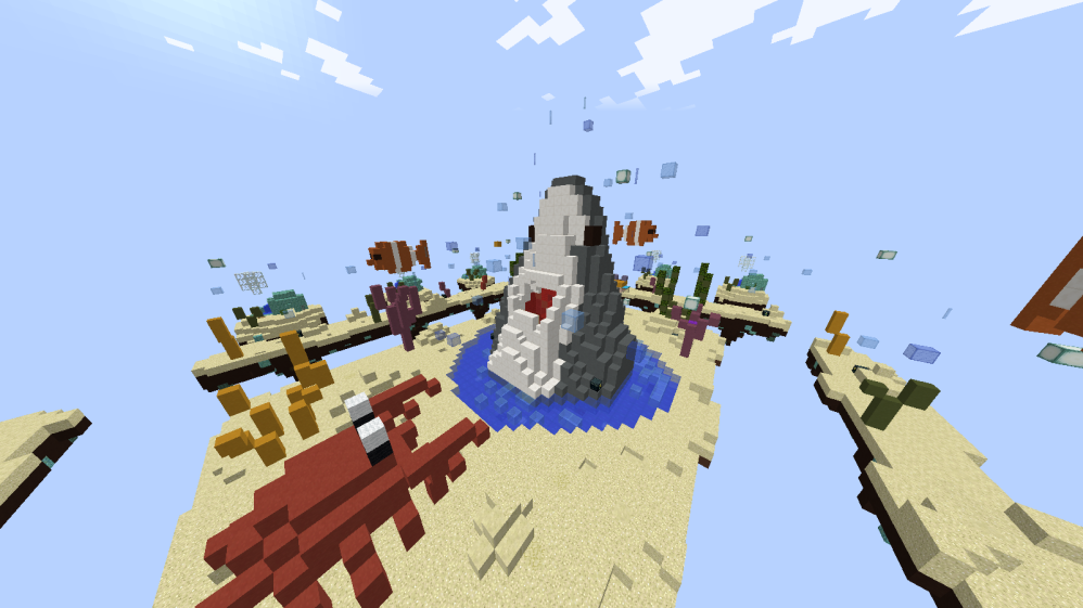
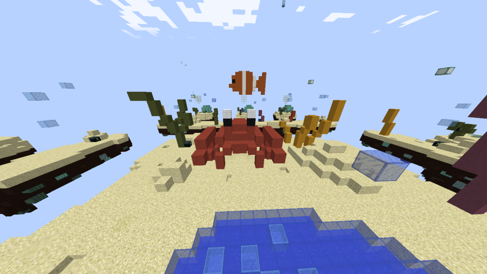
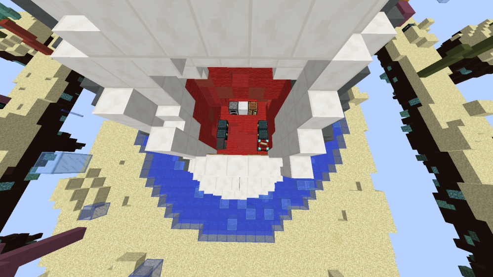
The starter islands and the sub-middle islands look a bit small and I think they need more details to make them look more interesting, they're almost empty. I also find the middle island a bit boring with that square shape.

I think the layout you used is a classic and maybe you should try to make a layout never seen before that can make the gameplay different.
Also, as I said before, the "under the sea" theme is a classic as well. I'd like to see new themes, you'd have more chances that your map will be accepted.
 

YeaUhm

Well-Known Member
Mar 15, 2020
404
503
109
18
Mars
Its like 50-50 for me, This theme is already much seen, Also those starting Islands are to small in my opinion. I Love to see the time and effort you took to create this map. Keep the good work up, I'd love to see more map submissions of you.

Have a great day!
 
  • Like
Reactions: Rachelll
Apr 10, 2020
63
31
24
Earth
youtube.com
Its like 50-50 for me, This theme is already much seen, Also those starting Islands are to small in my opinion. I Love to see the time and effort you took to create this map. Keep the good work up, I'd love to see more map submissions of you.

Have a great day!
The desert islands also are small, but nobody cares. -_-
 
  • Like
Reactions: Anneum

ItzEnd3r

Forum Expert
Aug 18, 2019
1,352
3,922
384
19
Boulder
www.cubecraft.net
Why is everyone voting No? It must have taken a lot of time and effort, I like the map dude keep up the good work
With map submissions even if you do like the map you need to vote whether or not you would choose to play it on the actual server. This makes people very picky and even the best maps we have seen in this section get nos and thats ok, when you make a map you need to expect negative feedback its what makes your maps better in the future. here are the 5 most recently accepted maps for reference (all but 1 have no's): here
 

Queen Ualala

Well-Known Member
May 4, 2020
943
1,441
129
Map looks really bland and basic, it looks like something I’d build.

If someone makes a water themed map make it like the Lucky Islands singleplayer map, that map is gorgeous
 

Rachelll

Member
May 7, 2020
12
25
29
21
I voted no,

The reason why I did, is because of the fact that its not symmetrical. Mainly because every single map is symmetrical, with the same distance to mid because you want to play it FAIR which is not required in this map.

Some islands are really close to mid which makes it easier to make those players go to mid faster WHICH makes them more op and can kill people faster, some islands are a bit too far from mid which makes them have worse loot because of the fact that they have a bigger distance.

Make sure to make the map symmetrical next time and make the map more logical because some things are weirdly placed like “the bubbles” in mid air or like the random shark in mid? I don’t know it looks cool but its random and not logical.

kind regards,

Rachel
 

Savvy

Well-Known Member
Aug 31, 2019
259
168
94
19
I can see you put a lot of thought in the idea and concept of the map. But I sadly voted no for these reasons:
1. The starter islands are small in my opinion
2. Lacks little detail that separates good maps from great maps
3. Islands are not evenly distributed

Add more detail and more overall shape and even out the islands then you should be really good. I love maps that have plenty of room to pvp in and not just get hit into the void.

I love the idea of what you did with the shark. Makes me think of Sharknado. And Nemo :)
 

Yamin

Forum Veteran
May 8, 2016
1,064
4,118
408
the sushi bar
Hello Skoedel, thank you for your efforts in submitting this.

Unfortunately, the design team have decided to deny this map submission due to the following reasons:
  • The map looks basic and quite empty
  • The terraforming looks too simple as does the lay-out of the map.
  • Recently we have accepted a map very similar to this.
 
  • Like
Reactions: Skoedel
Status
Not open for further replies.
Members Online

Latest profile posts

Sergiio12 wrote on LoveAndMafia's profile.
Alejaaaandro
Blom wrote on Lyriie's profile.
Lyriie, sorry for bullying you all the time :o
Ur an amazing staff member <3
mojang nerf mobile players pls
Someone nerfed me because I can't find those hidden chests as easily anymore.. I won't stop trying tho >:c
Top Bottom