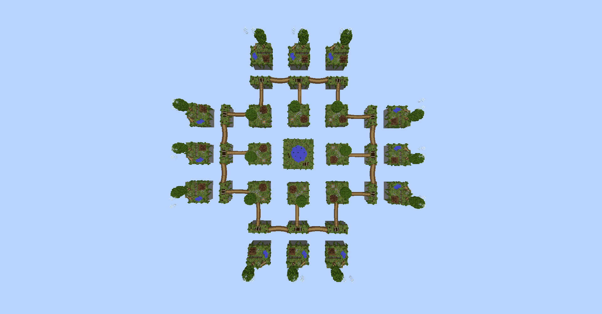
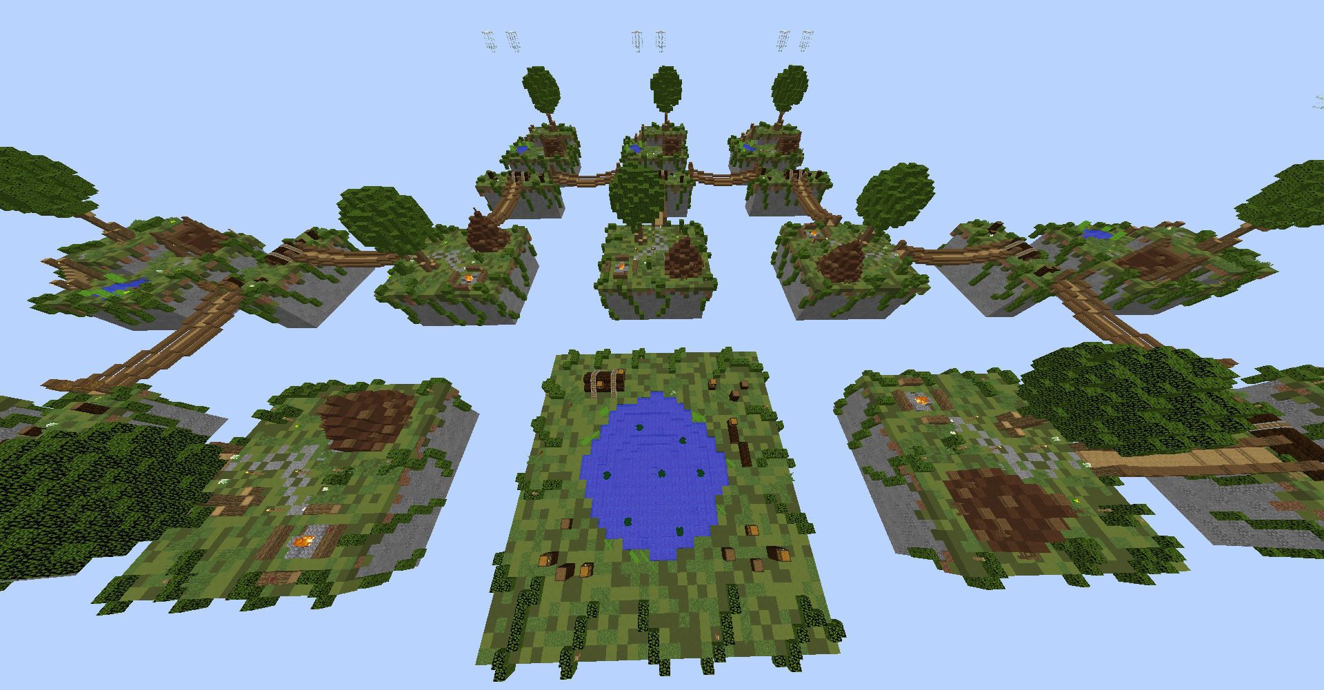
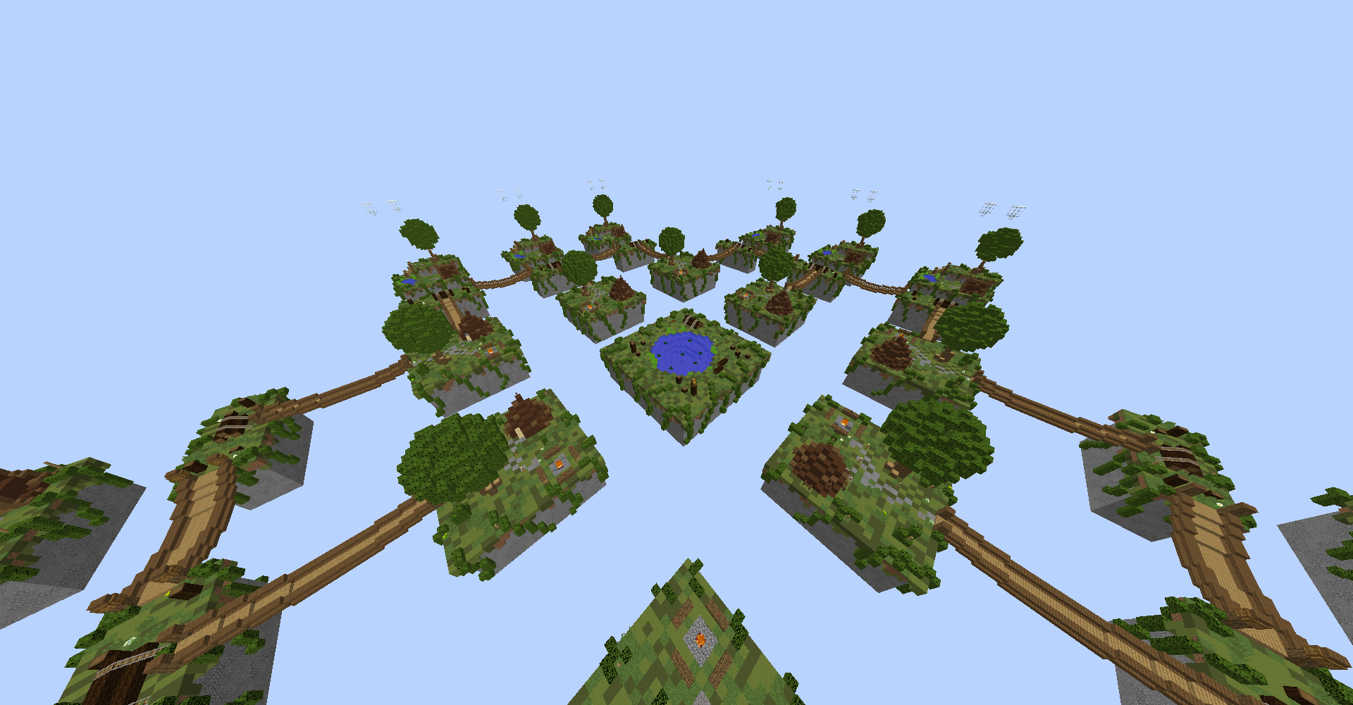
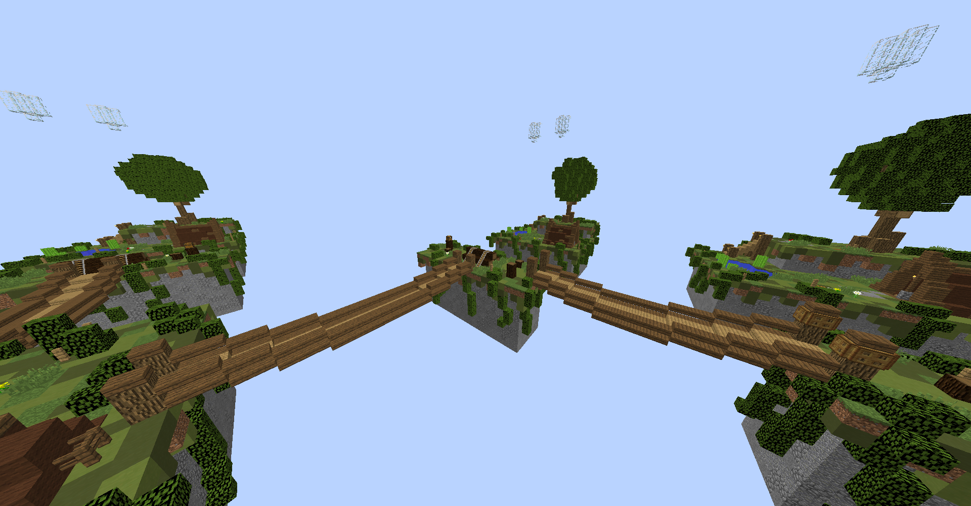
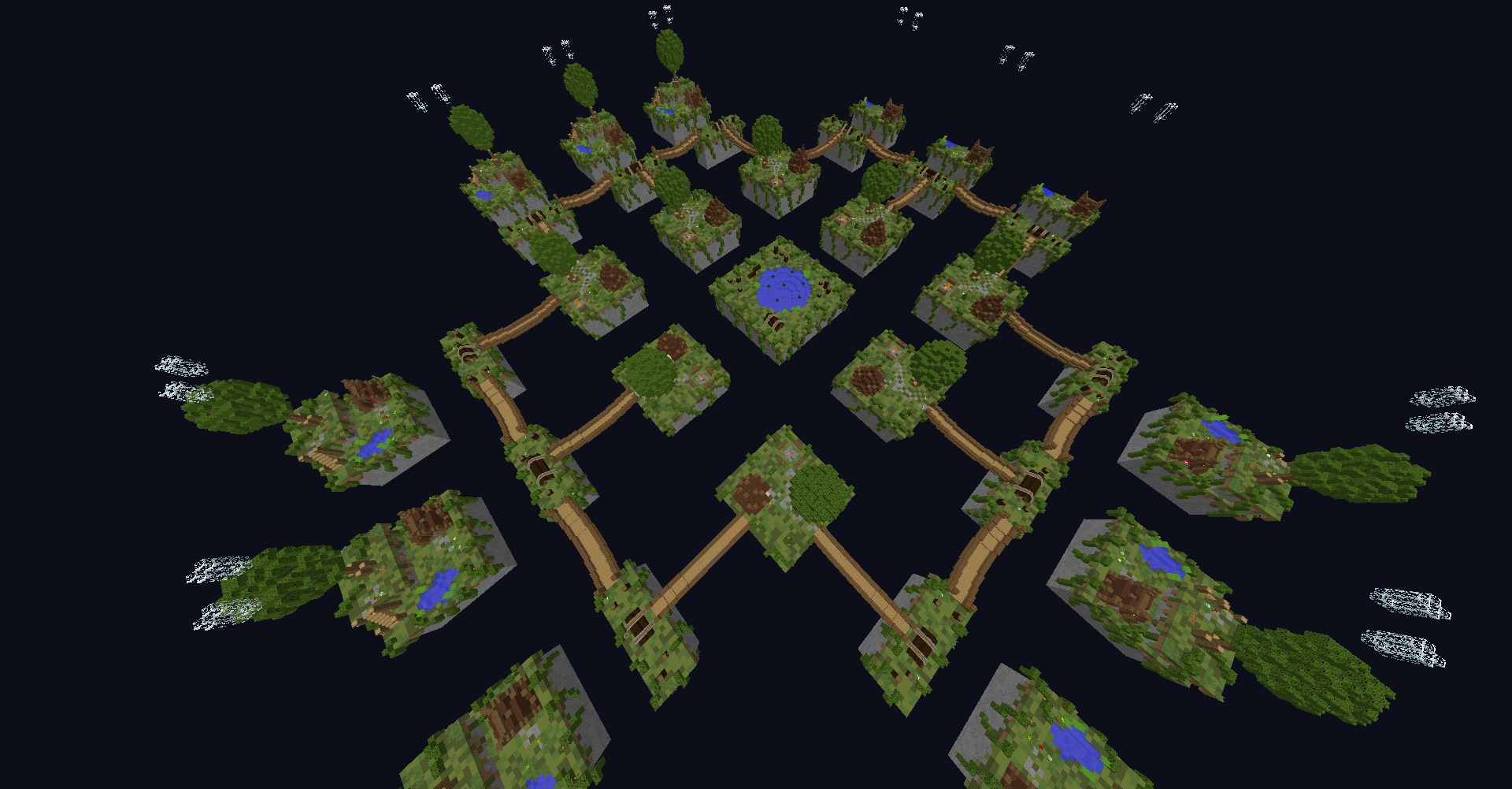
MAP DESCRIPTION:
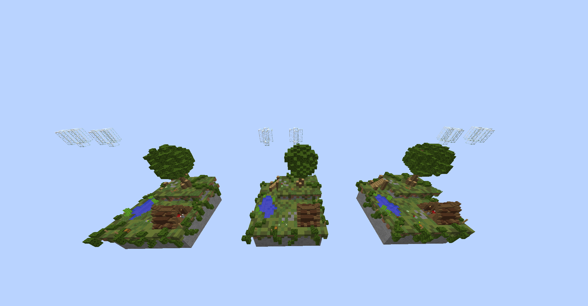
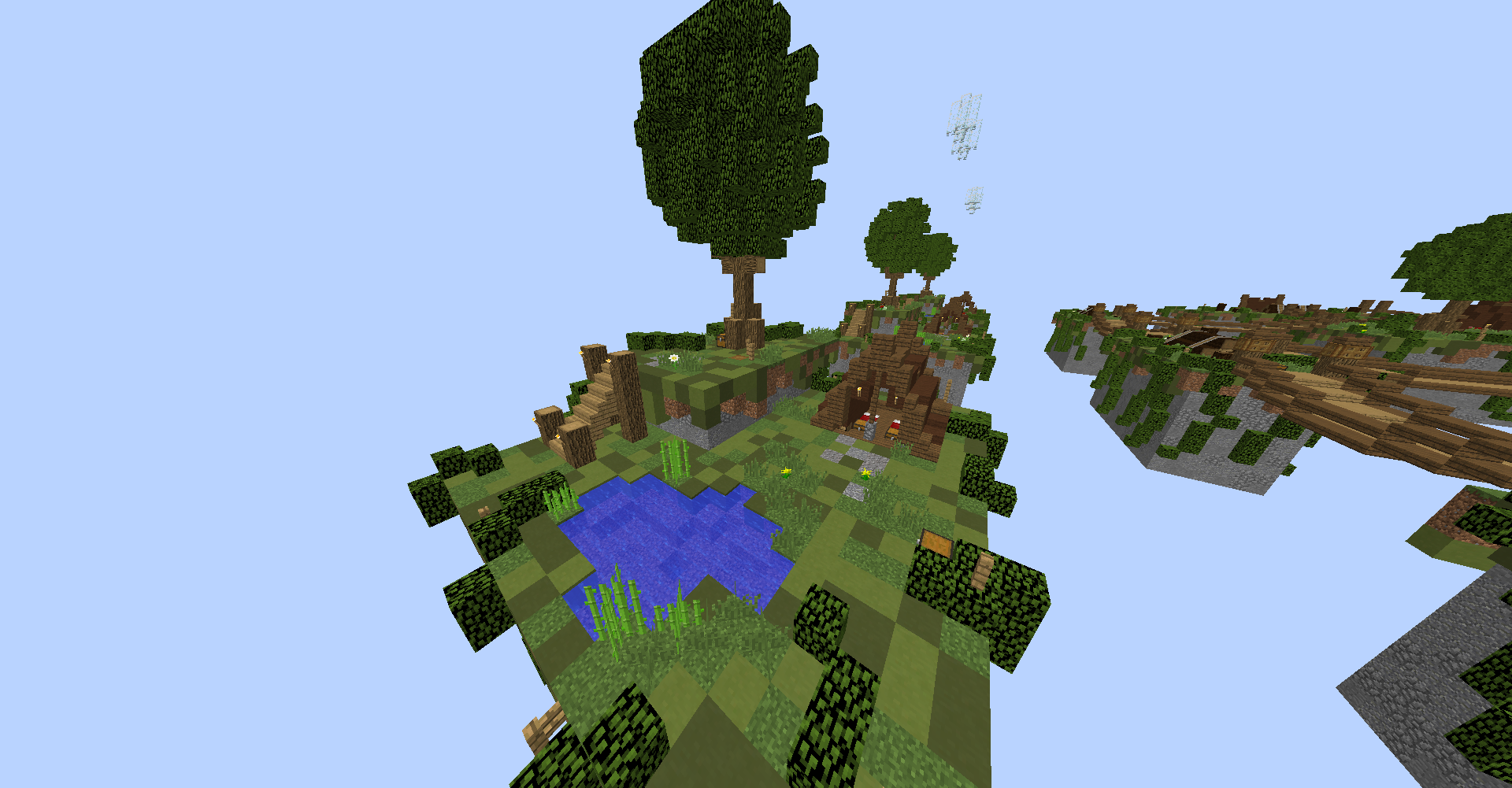
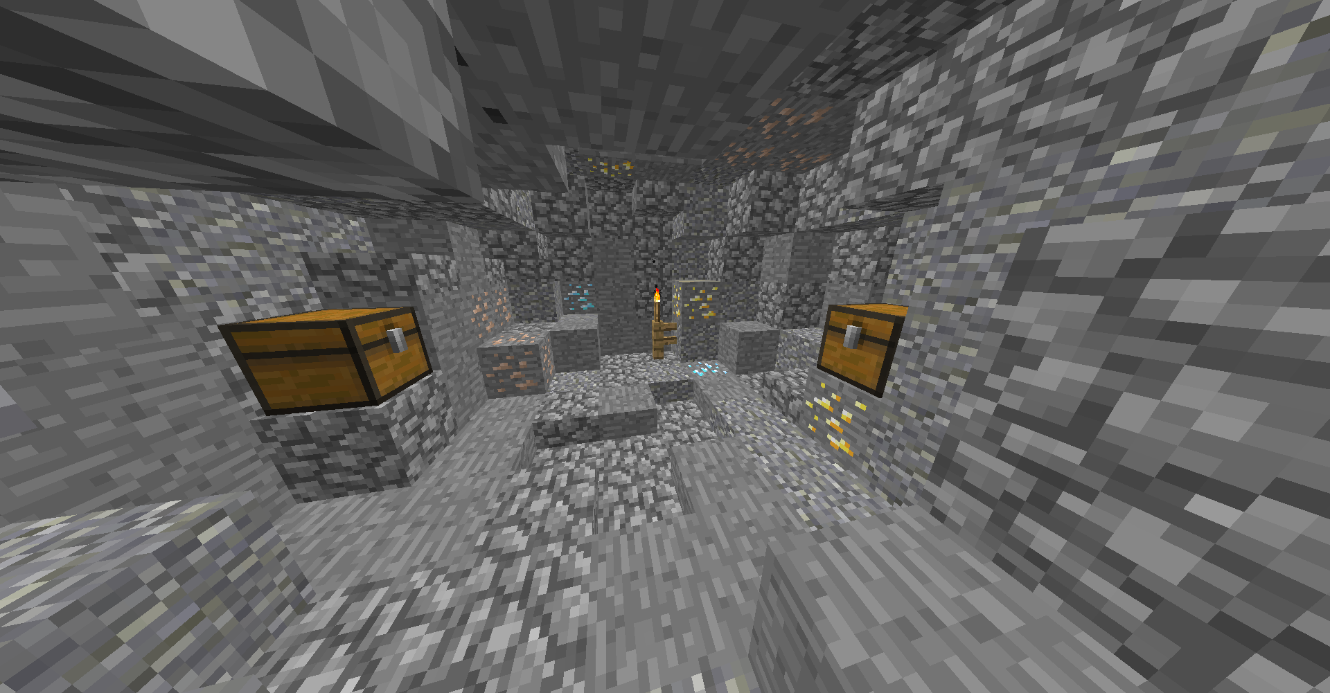
STARTER ISLAND:
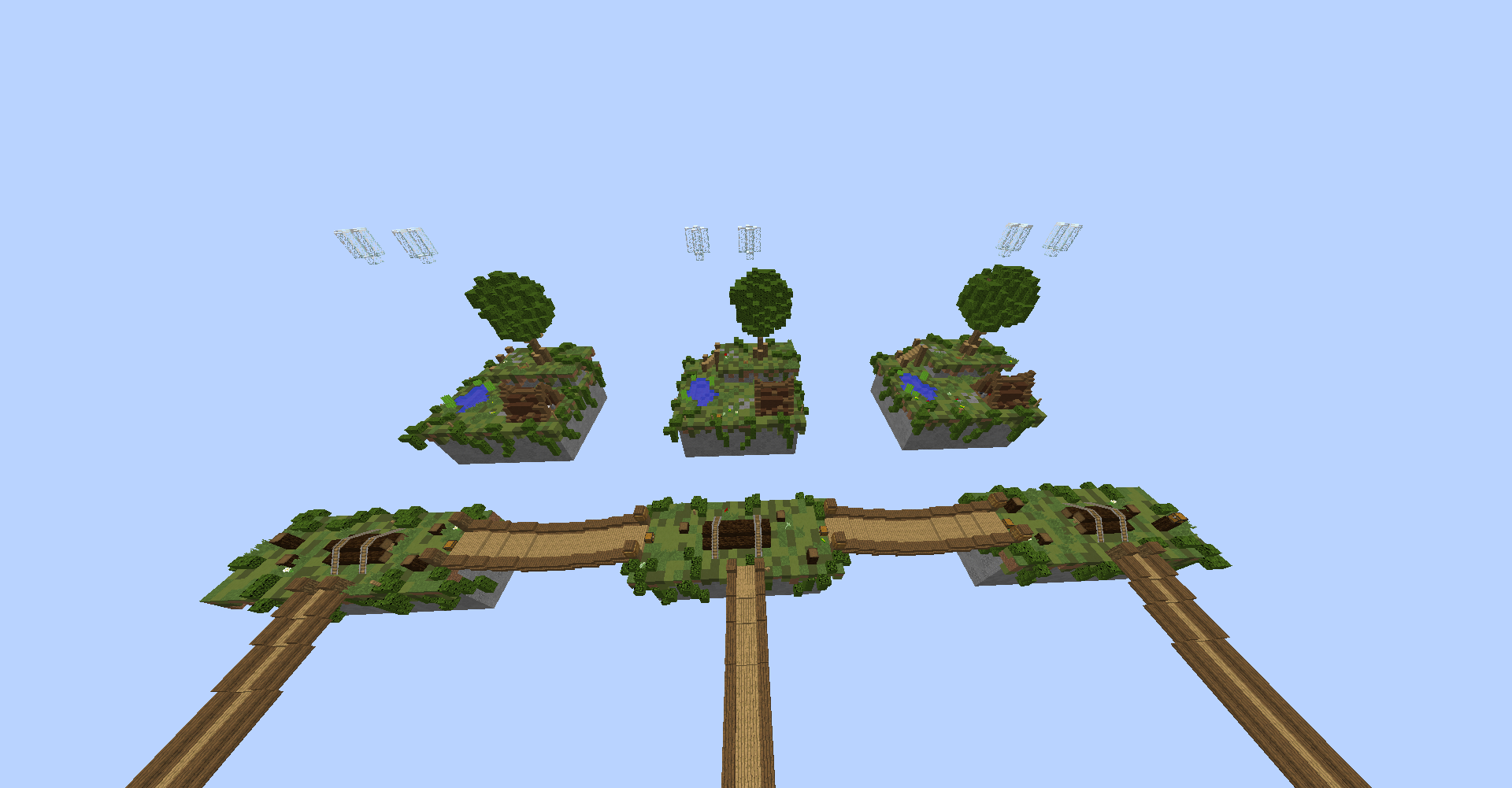
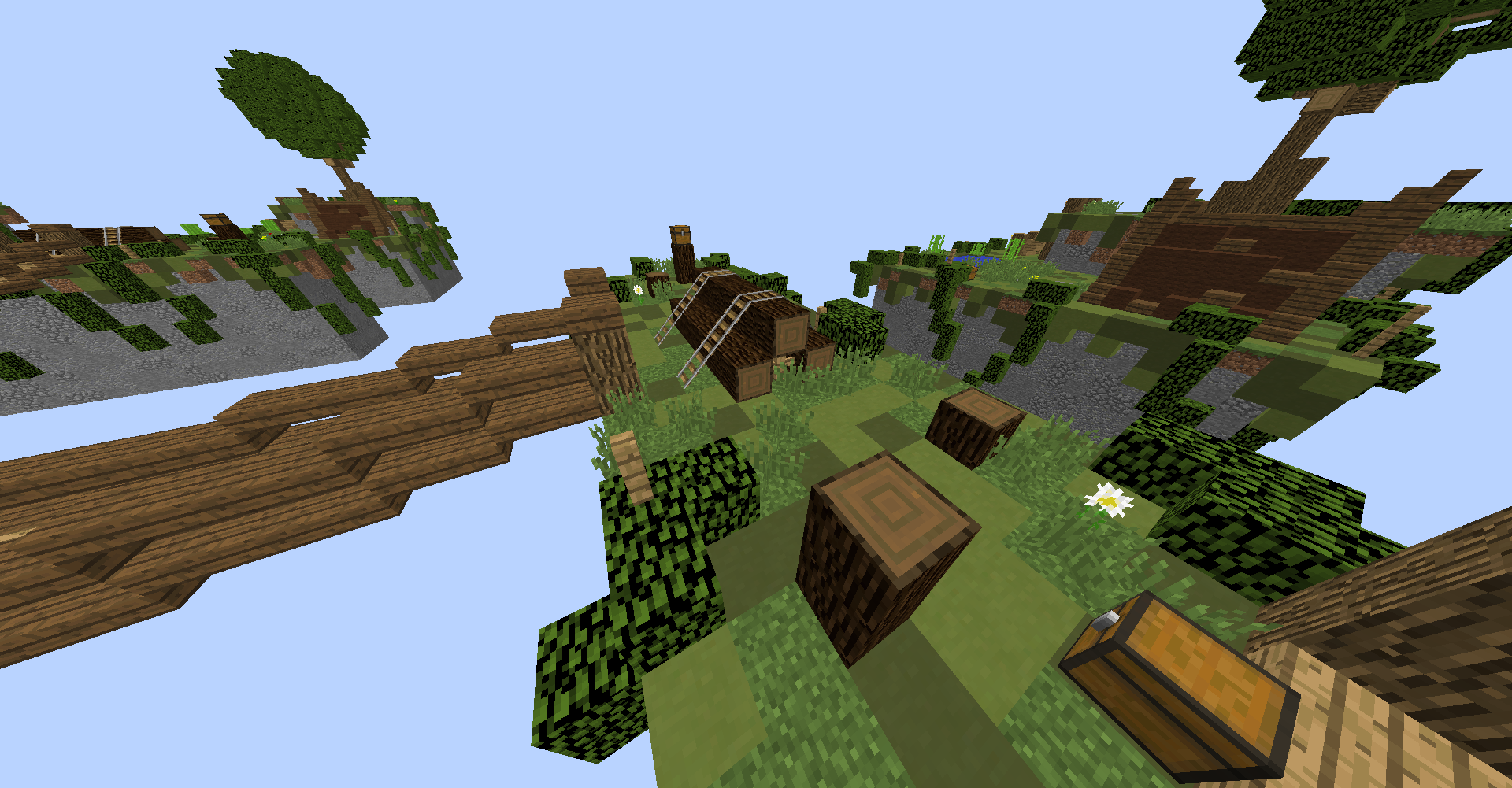
SUB-SUB-MID ISLAND:
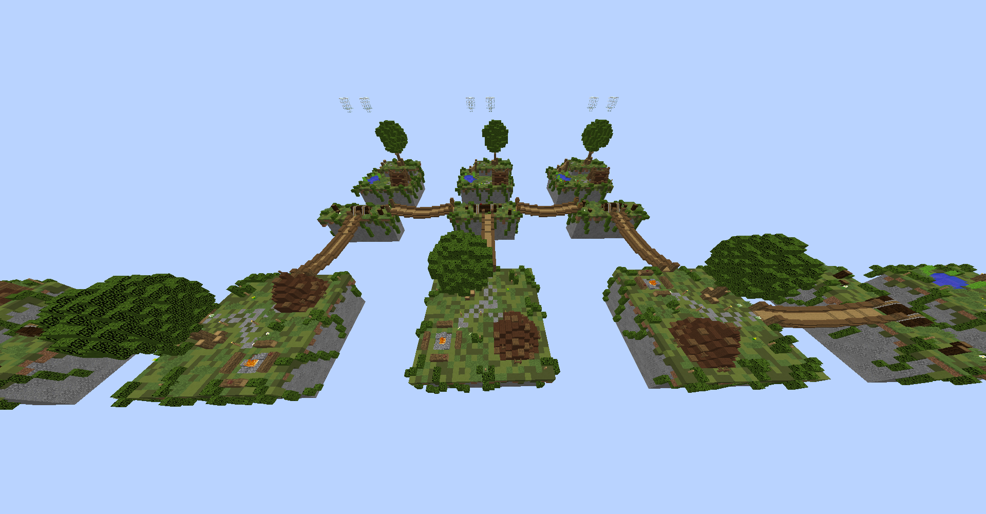
SUB-MID ISLAND:
MID-ISLAND:
- 24 players, 12 teams of 2.
- The map only includes 1.8 blocks.
- Flat areas, enough space to PVP on.
- 12 starter islands, 12 sub-sub-mid islands, 8 sub-mid islands, 1 mid-island which makes it a total of 33 different islands.
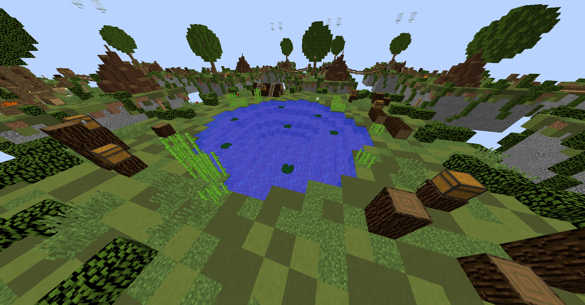
- The map does not contain any excessive amounts of lava or water.
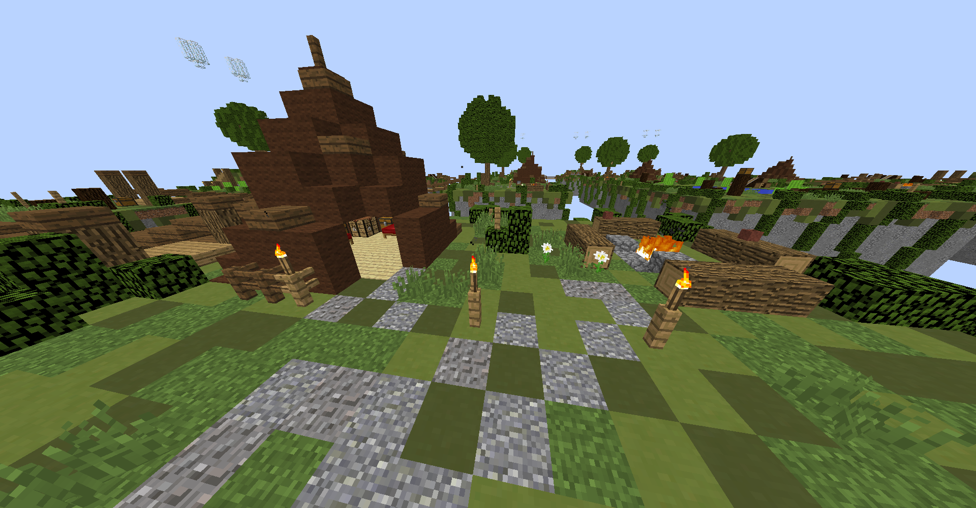
STARTER ISLAND:
- 6 chests.
- 1 oven.
- 1 crafting table.
- 3 diamond ores
- 3 gold ores.
- 6 iron ores.
- 6 coal ores.
SUB-SUB-MID ISLAND:
- 2 chests.
- Enough wood to chop!
SUB-MID ISLAND:
- 2 chests.
- 2 ovens.
- 1 crafting table
MID-ISLAND:
- 9 chests.