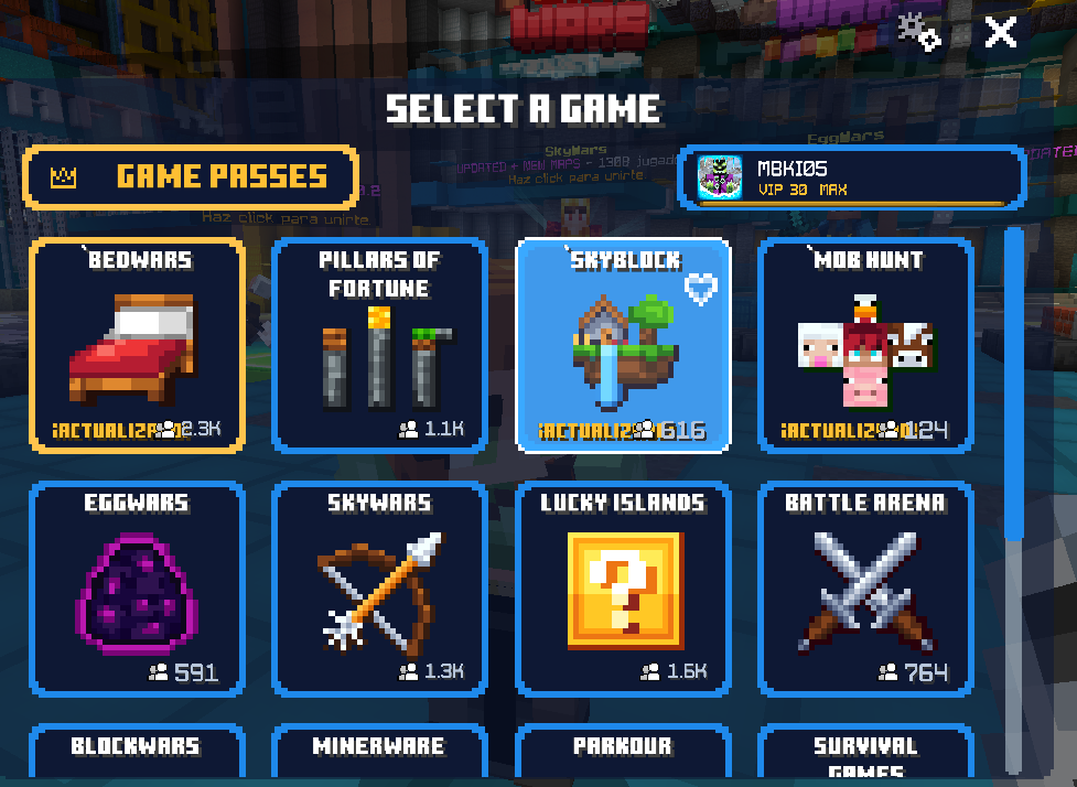
The new UI looks incredible; they just need to fix the issue where elements overlap—I imagine it's due to the Spanish language—but I definitely hope it gets added to other interfaces.
The new UI looks incredible; they just need to fix the issue where elements overlap—I imagine it's due to the Spanish language—but I definitely hope it gets added to other interfaces.
The new UI looks incredible; they just need to fix the issue where elements overlap—I imagine it's due to the Spanish language—but I definitely hope it gets added to other interfaces.
The new UI is good, but the layout seems to be designed to display English without any issues, so the Spanish you use and the Japanese I use probably won’t display properly, as shown in the image.
Also, notations like “1.6k” seem rather unfriendly to Asian players.
The new UI is good, but the layout seems to be designed to display English without any issues, so the Spanish you use and the Japanese I use probably won’t display properly, as shown in the image.
Also, notations like “1.6k” seem rather unfriendly to Asian players.
This site uses cookies to help personalise content, tailor your experience and to keep you logged in if you register.
By continuing to use this site, you are consenting to our use of cookies.






 Glad you like the new UI!


