Minecraft PC IP: play.cubecraft.net

Should this map be added?

  • Yes

    Votes: 9 45.0%
  • No

    Votes: 11 55.0%

  • Total voters
    20

Begijntje

Well-Known Member
Apr 17, 2019
109
948
144
This is my first one, so please go easy on me.
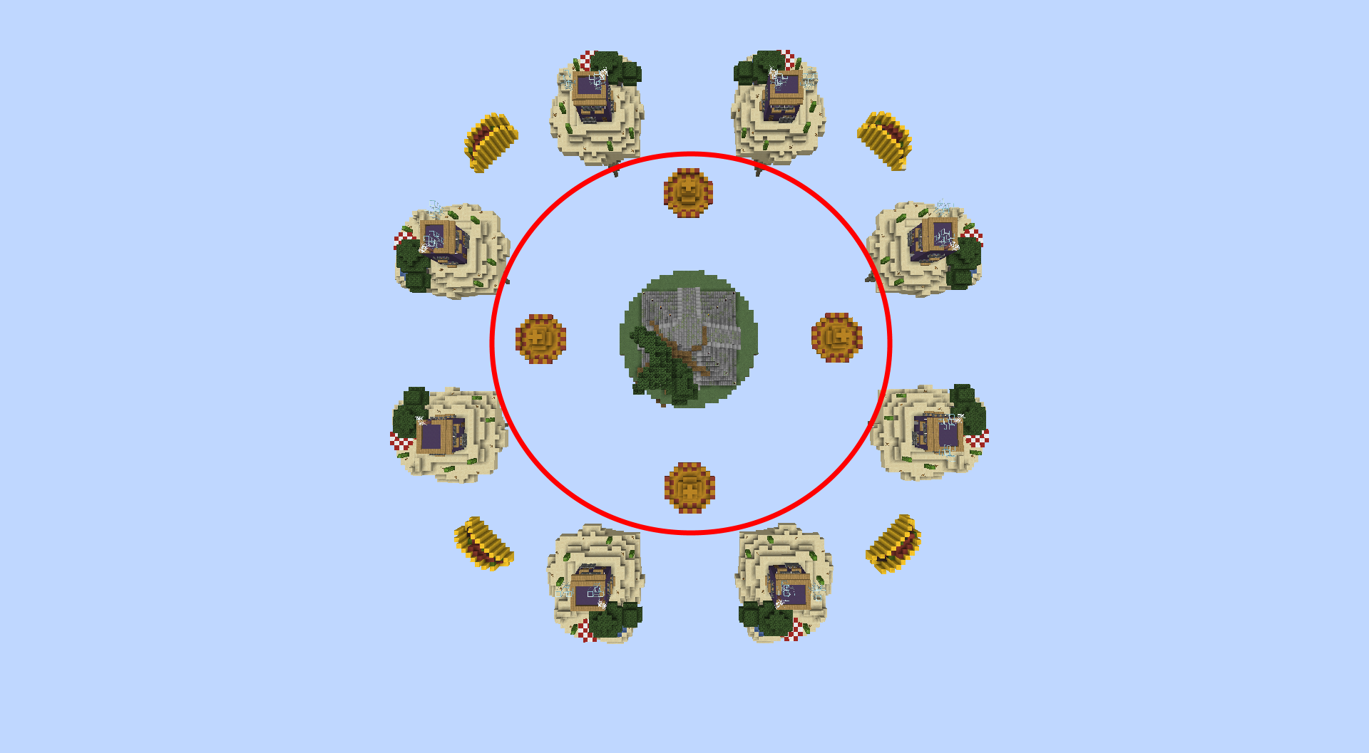
Map name: Mexico.

Creators: Rens__NL , Con_Vict

Map of 16, teams of 2.

Amount of chests per Starter Island: 5.

Now yes, i know it needs some improvement here and there.

EDIT: You can share your feedback for now, i'm gonna add more detail and update it whenever i can.
 

Attachments

  • 2019-12-04_22.54.52.png
    2019-12-04_22.54.52.png
    636.2 KB · Views: 142
  • 2019-12-04_22.52.46.png
    2019-12-04_22.52.46.png
    1.1 MB · Views: 186
  • 2019-12-04_22.52.35.png
    2019-12-04_22.52.35.png
    761 KB · Views: 138
  • 2019-12-04_22.50.28.png
    2019-12-04_22.50.28.png
    1.1 MB · Views: 130
  • 2019-12-04_22.58.10.png
    2019-12-04_22.58.10.png
    817.5 KB · Views: 146
  • 2019-12-04_23.02.50.png
    2019-12-04_23.02.50.png
    1.3 MB · Views: 135
Last edited:

Haighers112

Member
Jul 5, 2019
52
57
19
The map is clearly not up to scratch with CubeCraft in my opinion, not trying to be mean when I say this but if you know it needs improvement why not post it in creations and get opinions on what to change and make better instead of straight away posting it in map submissions.
 
  • Like
Reactions: Begijntje

Begijntje

Well-Known Member
Apr 17, 2019
109
948
144
The map is clearly not up to scratch with CubeCraft in my opinion, not trying to be mean when I say this but if you know it needs improvement why not post it in creations and get opinions on what to change and make better instead of straight away posting it in map submissions.
I dont know if cube has a seperate section for that, Hence why i post it here. And also to see what peoples opinions were as of now.
 

Haighers112

Member
Jul 5, 2019
52
57
19
Thank you :) what part you think needs improvement, specifically?
I think the outer islands are fine as they are but something with the middle seems off to me, not the hats though they go well with the theme! I think it may look plain but this might just be to me
aRIcfYX.png
 
  • Like
Reactions: Begijntje

RickDeKlomp

Forum Expert
Jun 11, 2017
852
2,687
358
The Netherlands
To be honest, this map is pretty nice. The terraforming could be better, also remove the iron bars in front of the windows and doors. Use some patterns for the grass on the middle islands.
 
  • Like
Reactions: Begijntje

Begijntje

Well-Known Member
Apr 17, 2019
109
948
144
I think the outer islands are fine as they are but something with the middle seems off to me, not the hats though they go well with the theme! I think it may look plain but this might just be to me
aRIcfYX.png
I think the outer islands are fine as they are but something with the middle seems off to me, not the hats though they go well with the theme! I think it may look plain but this might just be to me
aRIcfYX.png
I get what you mean. Not gonna lie its made with worldedit and didnt alter the shape.
 

Begijntje

Well-Known Member
Apr 17, 2019
109
948
144
To be honest, this map is pretty nice. The terraforming could be better, also remove the iron bars in front of the windows and doors. Use some patterns for the grass on the middle islands.
I do that manually, so it cant be 100% perfect. Thanks for the feedback!
 

Begijntje

Well-Known Member
Apr 17, 2019
109
948
144
In my opinion, it is very good. Although perhaps for now you need more islands and be more expansive.
I think 16 is a decent, standard size. Also, by expansive, do you mean that i need to remove the islands further from each other?
 

Begijntje

Well-Known Member
Apr 17, 2019
109
948
144
I ever so slighty changed the middle, so it doesn't look as plain anymore. I know it's still not 100%, but i think it looks better than a plain sphere.
 

Attachments

  • 2019-12-05_01.16.21.png
    2019-12-05_01.16.21.png
    1.1 MB · Views: 87

Begijntje

Well-Known Member
Apr 17, 2019
109
948
144
We changed the middle a bit, opinions?
 

Attachments

  • 2019-12-05_17.09.37.png
    2019-12-05_17.09.37.png
    1.7 MB · Views: 90

Kozi

Dedicated Member
Jul 23, 2017
175
1,035
203
20
Gallia Belgica
I like the map, but I have some doubts. I just don't think buritos, sombreros and houses can go in one map. They are so different from eachother that it is just very weird to have them in one map. A comparison would for example be: 'Belgian Fries, Soccer and the Atomium'. These would also not fit in one map, right? Also, my knowledge of Mexico is limited and I don't understand what barricaded houses have to do with Mexico. Could you explain me? I also think that the sombreros are too simple. The starter islands are too far from the middle so it would be a pain to buid to it. I like the design of the (updated) middle though!

Conclusion: There is still (some) work to make it a good map, but it has potential.
Note: I can't build. This map is already better than I'll ever make. I'm just giving my critism.
 

Begijntje

Well-Known Member
Apr 17, 2019
109
948
144
I like the map, but I have some doubts. I just don't think buritos, sombreros and houses can go in one map. They are so different from eachother that it is just very weird to have them in one map. A comparison would for example be: 'Belgian Fries, Soccer and the Atomium'. These would also not fit in one map, right? Also, my knowledge of Mexico is limited and I don't understand what barricaded houses have to do with Mexico. Could you explain me? I also think that the sombreros are too simple. The starter islands are too far from the middle so it would be a pain to buid to it. I like the design of the (updated) middle though!

Conclusion: There is still (some) work to make it a good map, but it has potential.
Note: I can't build. This map is already better than I'll ever make. I'm just giving my critism.
It's actually a taco FYI, but i understand you. I got inspiration for those bars infront of the windows and door because Mexicans have the tendancy to do that.

And when it comes to all these things not fitting with each other: A lot of Stereotypes were used to make it more Obvious what it was supposed to represent.

Thanks for the criticism :)
 
  • Like
Reactions: Kozi

Kozi

Dedicated Member
Jul 23, 2017
175
1,035
203
20
Gallia Belgica
It's actually a taco FYI, but i understand you. I got inspiration for those bars infront of the windows and door because Mexicans have the tendancy to do that.

And when it comes to all these things not fitting with each other: A lot of Stereotypes were used to make it more Obvious what it was supposed to represent.

Thanks for the criticism :)

Yes, of course, taco's, I'm dumb xD
 
  • Like
Reactions: Begijntje

Begijntje

Well-Known Member
Apr 17, 2019
109
948
144
I like the map, but I have some doubts. I just don't think buritos, sombreros and houses can go in one map. They are so different from eachother that it is just very weird to have them in one map. A comparison would for example be: 'Belgian Fries, Soccer and the Atomium'. These would also not fit in one map, right? Also, my knowledge of Mexico is limited and I don't understand what barricaded houses have to do with Mexico. Could you explain me? I also think that the sombreros are too simple. The starter islands are too far from the middle so it would be a pain to buid to it. I like the design of the (updated) middle though!

Conclusion: There is still (some) work to make it a good map, but it has potential.
Note: I can't build. This map is already better than I'll ever make. I'm just giving my critism.
Actually, you need to look at it like this: It's all about the map theme, for example the map fruit is only about exactly that, but just 'Mexico' isn't specific, which is why i added several stereotypes.
 
Last edited:

Begijntje

Well-Known Member
Apr 17, 2019
109
948
144
To be honest, this map is pretty nice. The terraforming could be better, also remove the iron bars in front of the windows and doors. Use some patterns for the grass on the middle islands.
I've redone the terraforming, since i did think it was a bit 'drastic' previously:
 

Attachments

  • 2019-12-14_13.36.26.png
    2019-12-14_13.36.26.png
    1 MB · Views: 80
Members Online

Members online

Latest posts

Latest profile posts

This is YOUR daily dose of facts #19-
The Sun makes a sound but we can't hear it.
Reesle wrote on xireu's profile.
Welcome to the Forums! Hope you enjoy your stay :D
Reesle wrote on Mantas2221's profile.
Welcome to the Forums! 👋
been working on chapter 4 + some changes to fhg
UncleSpect wrote on vk4zuta's profile.
thank you for the follow!
Top Bottom