Minecraft PC IP: play.cubecraft.net

Jackelele

Well-Known Member
Apr 14, 2017
425
888
123
23
United Kingdom
jackelele.co.uk
Hello,

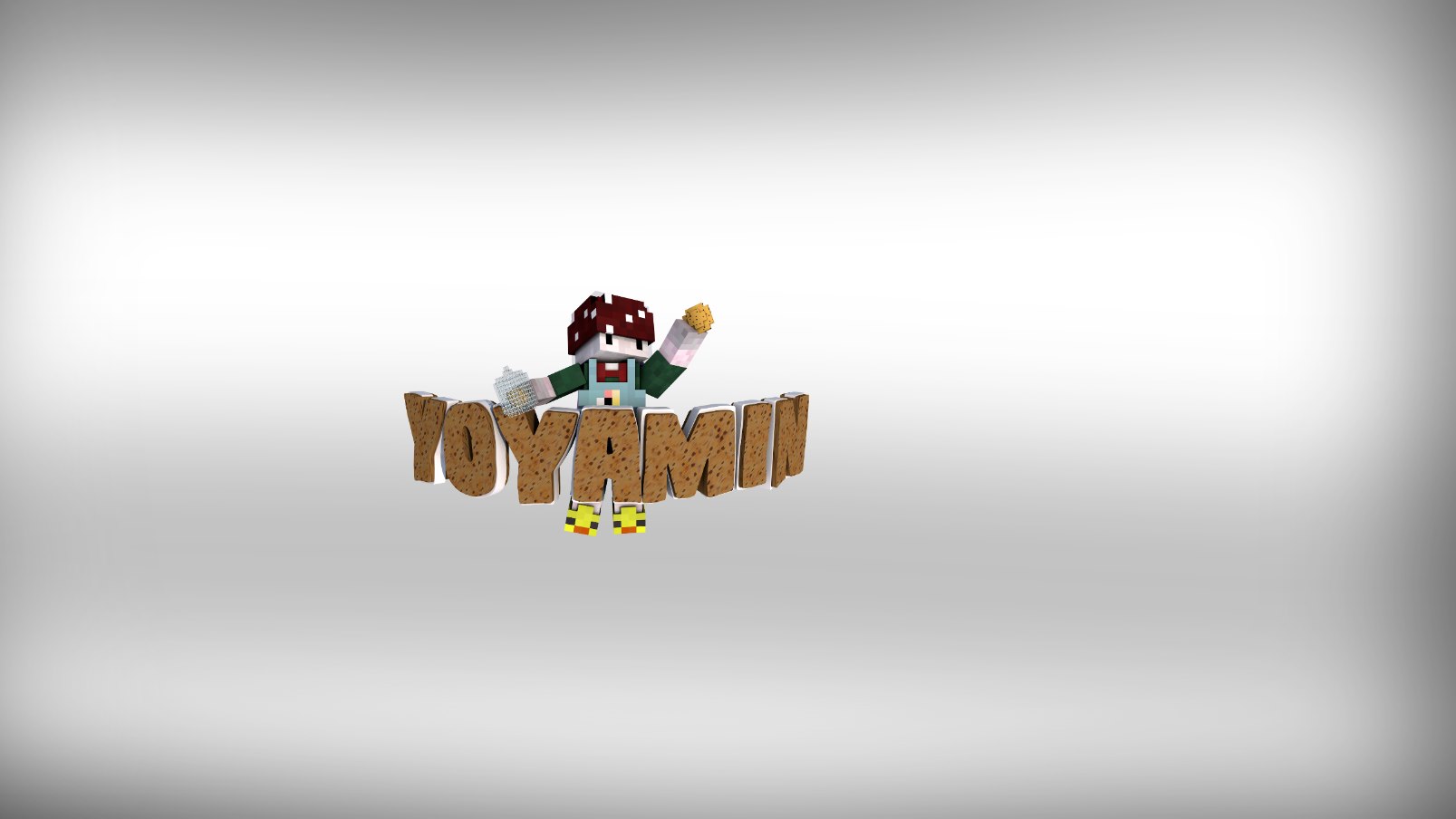
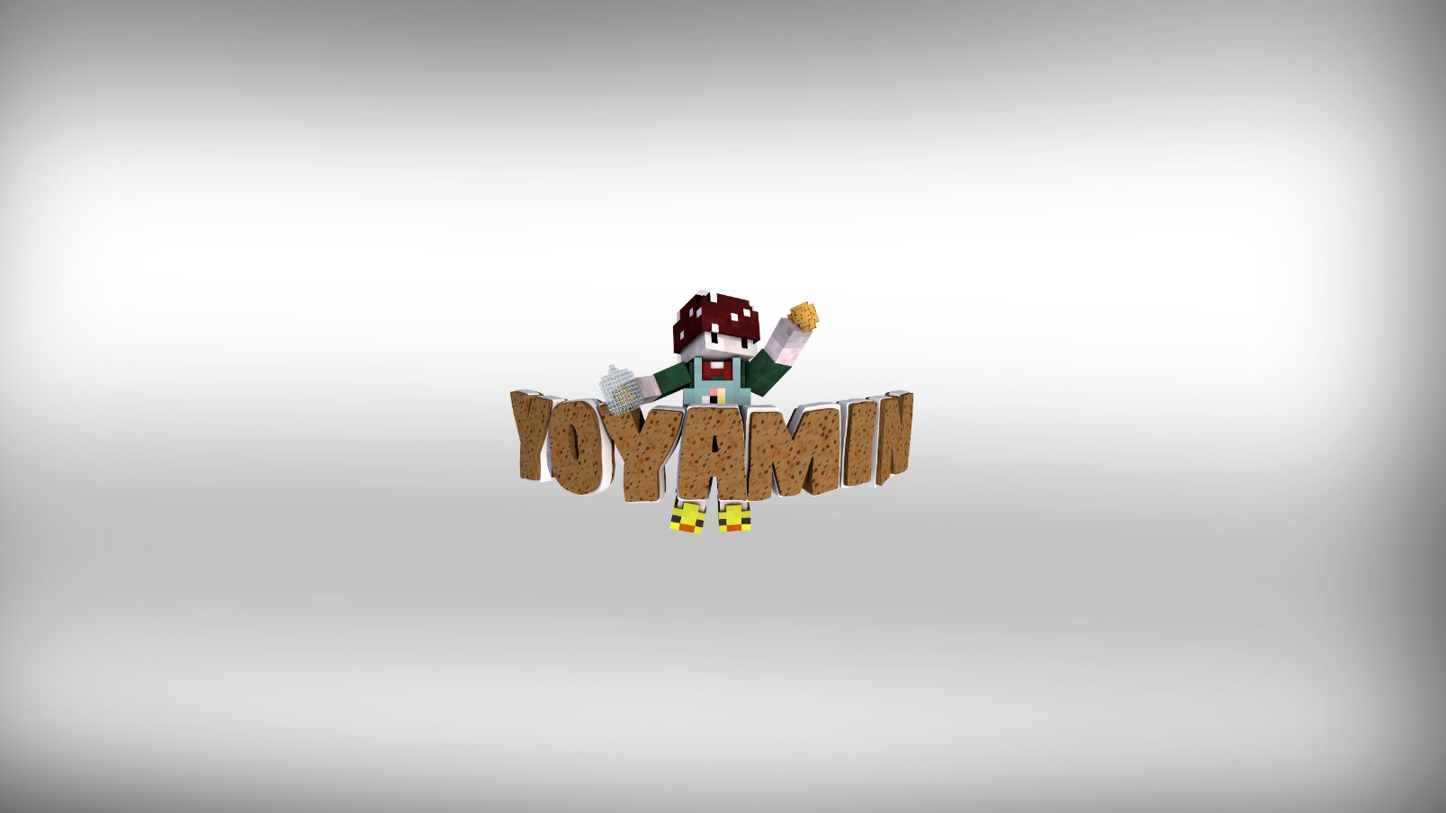
After posting this thread of my first Cinema4D Render of a Minecraft character, I was determined to put all of what I can do together and the outcome is below. Any feedback or suggestions on what I could improve or should do next is appreciated and please do comment something ;)

tA1sjTK.png


I will admit there are some sizing issues with the icons on the left, I may fix this later on.

<3 Jackelele
 

Story

Forum Professional
Jan 30, 2014
4,575
18,917
679
23
Glasgow
letterboxd.com
Very impressive, but with everyone there are things that could be improved:
  • Center the text more
  • If you're adding the background in post editing then try to shade the rendered skin so that it blends and looks like he's in the scene
  • Try a 3D background with the character actually in it.
  • Put some white light over the text where the lens flare is coming from, to make it look like the text is also in the scene.
  • Move rendered skin closer to the middle.
But overall you should be constantly trying new things, that's the only way you'll get better. I wish you the best with your graphics, you're doing fantastic work.
 

Jackelele

Well-Known Member
Apr 14, 2017
425
888
123
23
United Kingdom
jackelele.co.uk
Very impressive, but with everyone there are things that could be improved:
  • Center the text more
  • If you're adding the background in post editing then try to shade the rendered skin so that it blends and looks like he's in the scene
  • Try a 3D background with the character actually in it.
  • Put some white light over the text where the lens flare is coming from, to make it look like the text is also in the scene.
  • Move rendered skin closer to the middle.
But overall you should be constantly trying new things, that's the only way you'll get better. I wish you the best with your graphics, you're doing fantastic work.

Ahaha, thanks for the reply,

1. Text was meant to be placed there, I know how to center things, I didn't center it purposely.
2. I prefer it when the character it's not in the background but thanks xD
3. Hm yeah, this was my first time with the lens flare etc.
4. I didn't want the character in middle either, so you can actually see the background ;)
Thanks <3
 

Story

Forum Professional
Jan 30, 2014
4,575
18,917
679
23
Glasgow
letterboxd.com
1. Text was meant to be placed there, I know how to center things, I didn't center it purposely.
It makes it look really odd, things are supposed to be centered, because that's where people's focus is when looking at a channel art.

2. I prefer it when the character it's not in the background but thanks xD
I'm honestly frazzled as to why you prefer it... o_O

4. I didn't want the character in middle either, so you can actually see the background ;)
There's a reason it's called a background ya know. :p
 
  • Like
Reactions: Jackelele

Soeshi

Forum Veteran
Mar 28, 2016
1,039
3,248
409
21
The Netherlands.
I should remove or make your social media smaller, it's ugly and biggggg.

But I really like the other things.

What @StorySays suggested is true. (I should do that to) :)
 

Cyqni

Forum Expert
Jul 24, 2015
1,408
2,729
283
22
a place where everything you touch turns to gold.
It makes it look really odd, things are supposed to be centered, because that's where people's focus is when looking at a channel art.
Couldn't be more wrong. In art, the main object is usually placed off-center because if it was in the center, it would get too much attention. Also, the picture looks bigger when the main object is off-center.
 
  • Like
Reactions: Jackelele

Story

Forum Professional
Jan 30, 2014
4,575
18,917
679
23
Glasgow
letterboxd.com
Couldn't be more wrong. In art, the main object is usually placed off-center because if it was in the center, it would get too much attention. Also, the picture looks bigger when the main object is off-center.
It's the main object, it's supposed to get attention, it's the text, it's the thing people read when they look at a channel art.
 

Jackelele

Well-Known Member
Apr 14, 2017
425
888
123
23
United Kingdom
jackelele.co.uk
Couldn't be more wrong. In art, the main object is usually placed off-center because if it was in the center, it would get too much attention. Also, the picture looks bigger when the main object is off-center.

It's the main object, it's supposed to get attention, it's the text, it's the thing people read when they look at a channel art.

@MaestroCygni is right, to be honest @StorySays
 

Jackelele

Well-Known Member
Apr 14, 2017
425
888
123
23
United Kingdom
jackelele.co.uk
You can't possibly compare the text on a channel art to a photograph of a landscape.
giphy.gif


Now tell me, which do you prefer?
5lTTDld.jpg

bjppgfs.jpg
You can't compare a banner with a background, a character, letters etc. with a picture where the letters and the character are combined (and thus one objet) and there is no background.

Please stop arguing on my thread ;-;
 
Members Online

Team online

Latest profile posts

Hoshi wrote on Egg🥚's profile.
Happy birthday Egg!! 🎉
Reesle wrote on Egg🥚's profile.
Happy Birthday 🥚
hey

if you dont find me playing cubecraft often then dont be surprised
obviously this doesnt mean that im quitting im just like drifting away since ive started to enjoy and play games other than minecraft so what im trying to say is
im not going to be as active ingame but i will be on the forumds
Xi1m wrote on Egg🥚's profile.
happy eggday
Mintypie231 wrote on Egg🥚's profile.
Happy birthday!!! 🎂🎈
Top Bottom